How would you improve the Metro map when it’s reprinted?
Washington DC Metro by Richard Ricciardi licensed under Creative Commons.
The Yellow Line will go to Greenbelt starting in July, and soon after, the Silver Line's phase two will open. This means that Metro will have to reprint all of its rail maps. Are there other things they should improve?
It won't be wholesale changes. In 2011, we ran a contest to completely redesign the Metro map, which led to a lot of great designs. The Silver Line was new, which meant a lot needed to change to fit three lines side by side in the core. Here's the winning entry, from designer and Transit Maps blog proprietor Cameron Booth:
Image by Cameron Booth used with permission.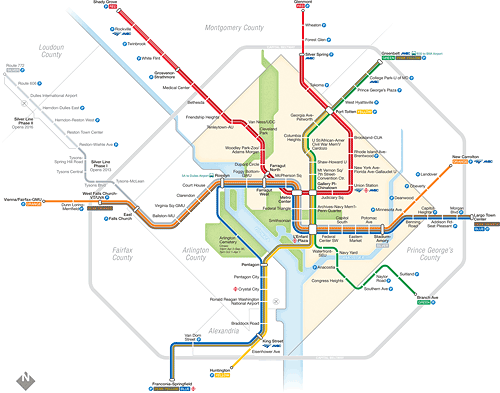
Metro ultimately had the map's original designer, Lance Wyman, update the map with slightly thinner lines and dots with “whiskers” to connect all three lines. At the same time, Wyman tweaked a few of the curves and angles and updated other map elements.
The public made suggestions too. For instance, the map had shown green space on the west side of the Anacostia River but not the east side, even though there's the large Anacostia Park along the east side of the river. Now, the map shows green there too.
One design for the map under consideration in 2013. Image by WMATA.
Metro changed sprawling, unwieldy, and often-mocked station names like “Mt Vernon Sq-7th St/Convention Center” to just “Mount Vernon Square” with the rest in subtitles. This was a suggestion from Matt Johnson and myself in the contest. (Unfortunately, the 7000 Series train announcements and train displays ignore this change and still use both main name and subtitle without distinction.)
Metro will have to reprint the maps to show the Yellow Line, and then again when the Silver Line to Ashburn opens, likely next year. Metro won't wholly redesign the map, but maybe there are opportunities to make a few small improvements. Perhaps Metro can show the future Potomac Yard station, move things around to make room to include the Purple Line, or ditch the H for hospital icons which probably aren't useful (does anyone really use the Metro map to figure out where there's a hospital?)
The current Metro map by WMATA._716_800.png)
What would you change?