New Metro map changes little but improves much
After carefully considering rider input and ideas from our map contest, WMATA and designer Lance Wyman have unveiled a draft of a new Metro map showing upcoming service changes.
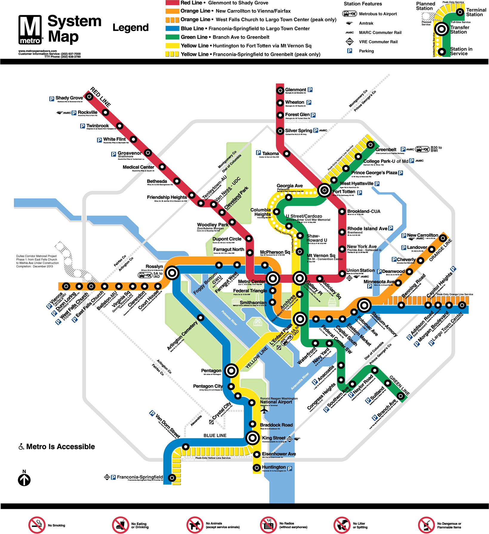
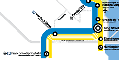
Image from WMATA. Click to enlarge.
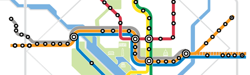
There were two big questions in the map contest. One was how to fit in the Silver Line on a map with fat lines and small station circles. The second was how to show new rush-
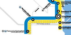
hour services between Franconia and Greenbelt as well as West Falls Church and Largo.
On the first, WMATA has decided to wait. The Silver Line isn’t running yet and won’t be for a few years. If they make room for a very long gray line through the core, it will take up a lot of visual space for little effect; Barbara Richardson, assistant general manager for customer service and communications, also noted that it could confuse riders.
Therefore, the draft map shows the line merging into the Orange Line at East Falls Church and then disappearing. One potential drawback is that some people will surely come to believe the actual trains will just end at East Falls Church, requiring a transfer to an Orange Line to continue the trip. That may not matter much, as they can’t take the trains today and will figure it out once trains start running along with new maps.
On the second, designers agreed with the direction most map contest entrants chose, to show versions of the Yellow Line splitting off to Franconia and Orange going to Largo. That’s the most sensible approach. However, they want your advice on one thing: should the line be dashed or striped? That’s one of many questions on a survey launching today.
Another issue our contest entrants wrestled with is how to show the fact that some trains currently short turn at Grosvenor, Silver Spring, and Mount Vernon Square, and in the future, will do so at West Falls Church as well. Wyman and the folks at WMATA came up with an interesting solution that wasn’t in the contest at all: a different symbol for such stations. The proposal is to add a dot to the center of the circle that denotes the station. The survey includes a question about whether that’s clear or confusing.
There are many smaller changes. Gone is what people’s choice winner Cameron Booth dubbed the “boxy Volvo” for parking icons; the new map will use the blue squares that are the universal symbol for parking (but the survey asks you if you want the old symbols or one of 2 new alternatives).
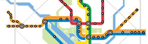
Buses to airports may get much more prominent icons showing a bus, an arrow, and an airplane (with 3 options in the survey). The station names still sometimes overlap lines, but at least the stations from Federal Center SW to Stadium-Armory appear at a 45° angle instead of the odd wedged-in angle on the current map.
The best change of all, of course, is the new “subtitles” for stations. The U Street, Woodley Park, Mount Vernon Square, Georgia Ave, Gallery Place, Archives, West Falls Church, Dunn Loring and Vienna stations all have those segments as their primary name and the remainder shown in smaller text. Richardson said in a Board meeting that “Ronald Reagan Washington National Airport” can’t be changed by federal law, but they still are able to make “Ronald Reagan Washington” smaller than the former station name, “National Airport.”
I’d still like to see all universities or other items after a dash or slash become subtitles. “Shaw-Howard U” is still a single name instead of “Shaw” with a subtitle of “Howard U.” Same for “Van Ness-UDC,” “Tenleytown-AU”, “Brookland-CUA,” “College Park-U of Md,” and “Ballston-MU.” If Gallaudet U is moved into a subtitle and so is “George Mason Law” (now the subtitle for “Virginia Sq”), why not do the same for all universities equally?
In the contest, we discussed some of the problems with stations appearing far from their real-life locations. The new map remedies some of this. The Green Line around Southern Avenue and Naylor Road actually travels northeast, with both stations near the DC-Maryland border, but the current map shows the line moving southeast as if Naylor Road were miles into Prince George’s County.
Some geographic distortions haven’t changed. Metro Center still looks much closer to the White House than McPherson and Farragut Squares, while the reverse is true. Union Station still looks very far from the Capitol, though it’s not. These are arguably much more important to fix, since tourists do make decisions about which station to use based on the map while Prince George’s commuters won’t to the same degree.
Farragut North and West have gotten closer together, but the draft map doesn’t reveal how WMATA officials hope to depict the planned out-of-system “Farragut Crossing” transfer, another subject of the map contest. It would also be helpful to move Metro Center and Gallery Place closer together, so riders at Gallery Place realize it’s often better to walk to Metro Center for a Blue or Orange train than to take the Red Line one stop.
The survey asks a number of other interesting questions. Do you prefer “peak” or “rush hours”? Should the map keep the prohibited items at the bottom, or is that really not appropriate for the map? And what about this: should the new Tysons/Dulles line be just another branch of the Orange Line?