Latest Metro map drafts add Anacostia parks and other tweaks
WMATA has a new set of 2 drafts for its map including the Silver Line, and has listened to several suggestions we made in the last round.

“Pill” option.
“Whisker” option.
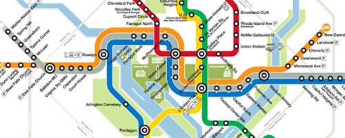
First, they added green space along the Anacostia, as I suggested last time. They also reversed the Orange and Silver Lines so that Silver crosses Orange by East Falls Church instead of Stadium-Armory, something several of you recommended. I think that looks good, though the West Falls Church station dot looks uncomfortably close to the Silver Line now; maybe it can move just a tad west?
The main question is still how to handle stations where 3 lines run parallel. They’ve made the “pill” station symbols in one option wider; last time, the pills were thinner than the station circles, making them look less unified. Now, the pills are wider but also shorter.
Meanwhile, the option of adding “whiskers” to the station symbols got a variant. Instead of black whiskers, they’re white. This actually evokes a little of Cameron Booth’s approach in his contest-winning map, where he just delineated each station with a short gap in each line. I was a strong proponent of the pill option before, but actually this white whisker alternative is growing on me. What do you think?
In addition, designer Lance Wyman and the WMATA team made the Silver Line darker and lightened the Beltway and jurisdiction borders (something else readers suggested); noted in text that the map is not to scale (sure, whatever), added the police phone number (reasonable), and made the lines even a little thinner.
What do you think?