More map contest results, part 3: Refreshing the old look
Many of the maps in our map contest took a radical approach to the redesign. But other designers opted more for a revamp of Wyman’s original map.
Two entries stood out for keeping the basic form of Wyman’s map, but at the same time offering a new look. One reduces clutter, the other for adds information, yet keeps a clean design.
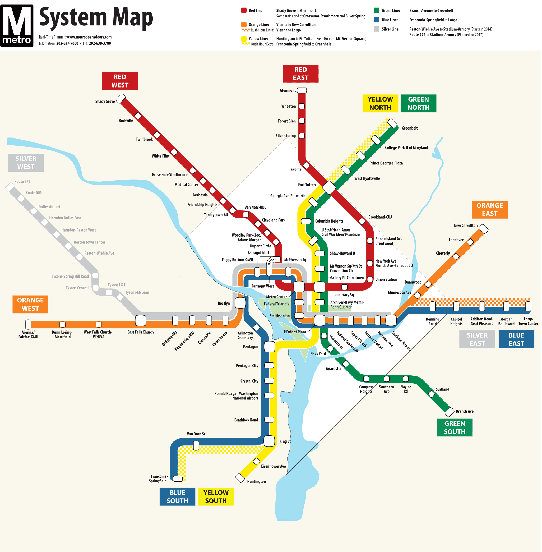
Map E, by Rik Silverman. Click to enlarge.
These entries are Map E, by Rik Silverman, and Map M, by David Jones. Map E received 78 first-place votes, the sixth highest in the first round. Map M got 74 first-place votes, putting it in 7th place. Because we used instant-runoff voting, Map E finished in 4th place, with 137 votes in round 13. Map M finished in 8th place with 82 votes.
Both maps used a similar approach to dealing with the bundling of 3 lines downtown. The designers used a subtle narrowing of the lines so that the width of 3 lines is the same as the width of 2 lines elsewhere on the map.
Map E was notable for using squarish icons to indicate stations. In cases where the map is cramped, leader lines connect station names to their icons for clarity. The width of the icon is based on how many lines it crosses.
Another notable feature was calling out the ends of each line with a geographic label. Calling the Glenmont end of the Red Line “Red East” could help orient riders.
This was one of 3 maps that chose to call out the District of Columbia by showing it as a different color. The part-time services were shown using a checkerboard pattern.

Map M, by David Jones. Click to enlarge.
Map M was one of several maps to include commuter rail lines. This is a helpful feature, and David was able to include these without adding too much clutter to the map.
Map M was the only map to show the Franconia-Greenbelt service with a blue line. Most maps showed it in yellow, and a few showed it as a unique color.
The spacing of stations and lines allowed the station name text to be more easily read than on the current map. And the use of larger and bolder font and a larger icon for transfer stations is good. The call-out boxes are tastefully done.
The large station circles give the map a nice visual appeal. And overall, it’s got a nice cohesive look.