From drive-thru to walk-up: Van Ness Walgreens
When we last looked at the proposed Van Ness Walgreens at Connecticut and Veazey, it was a suburban store plunked down in an urban lot next to a Metro station. The building was set far back from Connecticut Avenue, with parking in front, curb cuts on both Connecticut and Veazey, a big free-standing sign at the corner, and a seven-car drive-thru.
DDOT and community members opposed the plan as inappropriate to the city, especially a site right near Metro. In response, Walgreens completely reworked the proposal into something that belongs on an urban street corner. Instead of siting the building at the very rear of the lot, it now comes right up to the property line along Connecticut Avenue. A few parking spaces are in the rear, off the alley, and the rest underground. There are now only three above-ground spaces instead of seven in the original plan.
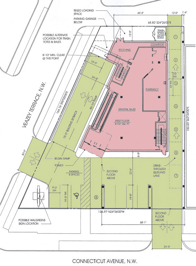
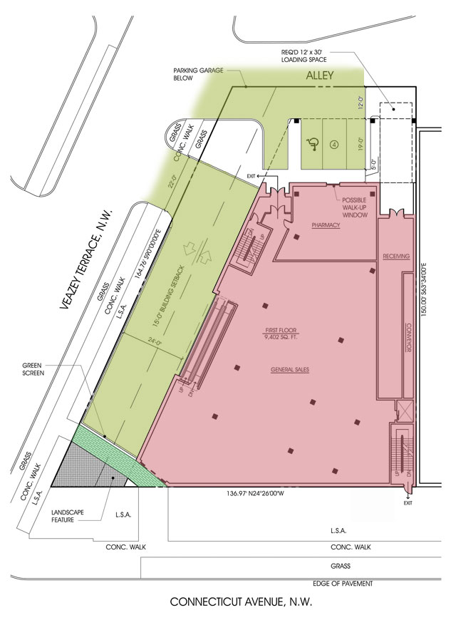
The above diagrams show the original proposal (left) and the current plans (right). Areas shaded in red are part of the building, yellow are areas used by vehicles, and green are pedestrian-only walkways. As you can see, on the old plan pedestrians had to cross the parking area and potentially conflict with parking and turning vehicles. Now, pedestrians can enter the store directly from the sidewalk.
Instead of a drive-thru, the plans show a “possible walk-up window” in the rear. That would let drivers pull in from the alley, get prescriptions, and drive away. If the store is intent on building infrastructure for drivers to avoid parking underground and entering the store, that’s a much better way. (They still might end up better off if they force people to actually enter the store and potentially see other items to buy, but that should be their own business decision.)
This design is a huge improvement over the original, but it’s never going to become a paragon of great urbanism. As with many drugstores, it has few windows—just near the escalators, the front door, and the possible walk-up window. And unlike drugstores like CVS that have windows but the store covers them up, the building won’t have them from the start. That means it’ll be more expensive for another store to reuse this space for a more window-oriented storefront retail in the future. (Depending how the building is designed, it may not even be possible without structural reinforcement.)
At the moment, the design doesn’t contain any bicycle parking. That’s one of many concerns raised by the local ANC, as reported in last week’s Current (article, continuation). The ANC’s resolution also raises concerns about traffic, delivery trucks, noise from mechanical equipment, lack of vegetation, and one particular tree that screens the gas station currently on the site from a nearby apartment building.
The developer’s traffic study should answer questions about the traffic impact, though I can’t see it being worse than a gas station. Neighbors want Walgreens to save the existing tree, add more vegetation on the site, and enclose the mechanical equipment to cut down on noise. According to the Current, the ANC wants further concessions on these issues before it will support the variances Walgreens needs to build this more urban-friendly design.
The new design is about 1/3 bigger (20,188 square feet of retail space versus 15,071 in the original) and, if I’m counting right, has 4 more parking spaces (31 versus 27). With the larger project they’re getting if granted the variance from lot coverage requirements, this project should be better for Walgreens as well as the community. It doesn’t seem unreasonable to ask Walgreens to include some bike parking, landscaping, and address mechanical noise in exchange.