How did Metro station balance change since 1995?
We could tell a lot about land use and commuting patterns in our region by looking at the balance between entries and exits at Metro stations. Comparing the new 2012 data with the 1995 data shows how land use and job patterns in our region have evolved.
Which stations’ balance has changed the most since 1995?
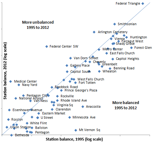
A station’s balance is the ratio of the entries to exits, with the greater number divided by the lesser. This chart plots each station’s balance in 1995 against its balance today. The closer to the bottom a station is, the more balanced it is now; the farther to the left, the more balanced it was in 1995.
Stations right on the blue diagonal line had no change in their balance or imbalance level, while stations farthest from the line have shifted the most in balance. Overall, Metro’s stations were less well balanced in 1995, as you can see from the way most stations fall below the line.
(Note that a station might have grown or shrunk in overall ridership tremendously, but not move on this particular graph, because it just looks at the balance, not the absolute ridership numbers for the station.)
The biggest permanent loss of balance is at Medical Center. (Federal Center SW has an inflated balance for 1995 because the east entrance to L’Enfant Plaza was temporarily closed at that time.) Here we see the effect of post-9/11 security — closing the NIH campus to the public severely curtailed pedestrian and bus access to the Metro station.
What happened to the most balanced stations?
The stations Matt identified as most unbalanced were similarly unbalanced then — in fact, the very worst balance was at the same station, Federal Triangle, in both years. But most of the stations that are well balanced today looked very different 17 years ago.
| Station | 1995 Entries | 1995 Exits | 1995 Bal. | 1995 Rank | 2012 Entries | 2012 Exits | 2012 Bal. | 2012 Rank | Bal. Chg. |
|---|---|---|---|---|---|---|---|---|---|
| Bethesda | 2,612 | 1,960 | 1.3 | 7 | 3,278 | 3,269 | 1.0 | 1 | 0.81 |
| Pentagon | 8,797 | 4,113 | 2.1 | 20 | 6,479 | 6,954 | 1.1 | 2 | 0.54 |
| Brookland | 2,172 | 1,059 | 2.1 | 17 | 2,075 | 1,914 | 1.1 | 3 | 0.57 |
| King Street | 1,573 | 824 | 1.9 | 15 | 2,986 | 2,712 | 1.1 | 4 | 0.62 |
| Mt Vernon Sq | 942 | 157 | 6.0 | 47 | 1,157 | 1,323 | 1.1 | 5 | 0.20 |
| Crystal City | 3,009 | 4,890 | 1.6 | 11 | 4,105 | 4,912 | 1.2 | 6 | 0.69 |
| Tenleytown | 1,520 | 1,070 | 1.4 | 8 | 1,849 | 2,218 | 1.2 | 7 | 0.91 |
| Ballston | 4,492 | 2,088 | 2.2 | 21 | 4,441 | 3,656 | 1.2 | 8 | 0.61 |
| Union Station | 6,938 | 7,193 | 1.0 | 1 | 9,712 | 12,030 | 1.2 | 9 | 1.11 |
| Waterfront | 1,108 | 1,345 | 1.2 | 5 | 1,334 | 1,015 | 1.3 | 10 | 1.01 |
| Shaw | 793 | 527 | 1.5 | 9 | 1,353 | 1,027 | 1.3 | 11 | 0.94 |
| White Flint | 1,608 | 840 | 1.9 | 16 | 1,599 | 1,168 | 1.4 | 12 | 0.77 |
| Rosslyn | 4,194 | 4,504 | 1.1 | 2 | 4,381 | 6,622 | 1.5 | 13 | 1.31 |
| U Street | 1,171 | 479 | 2.4 | 22 | 1,944 | 1,226 | 1.6 | 14 | 0.70 |
| Friendship Hts | 3,271 | 1,327 | 2.5 | 23 | 3,284 | 2,067 | 1.6 | 15 | 0.69 |
| Minnesota Ave | 1,182 | 228 | 5.2 | 41 | 1,147 | 717 | 1.6 | 16 | 0.33 |
| Dupont Circle | 3,936 | 7,344 | 1.9 | 14 | 3,793 | 6,118 | 1.6 | 17 | 0.81 |
| Eastern Market | 1,795 | 712 | 2.5 | 24 | 2,166 | 1,224 | 1.8 | 18 | 0.75 |
| Court House | 2,651 | 1,477 | 1.8 | 13 | 3,188 | 1,789 | 1.8 | 19 | 1.06 |
| Eisenhower Ave | 365 | 400 | 1.1 | 3 | 874 | 451 | 1.9 | 21 | 1.65 |
| Stadium Armory | 1,239 | 591 | 2.1 | 19 | 1,140 | 583 | 2.0 | 22 | 1.00 |
| Clarendon | 1,411 | 409 | 3.4 | 30 | 1,807 | 922 | 2.0 | 23 | 0.61 |
| Anacostia | 5,064 | 717 | 7.1 | 49 | 3,023 | 1,433 | 2.1 | 24 | 0.32 |
| Virginia Sq | 1,246 | 349 | 3.6 | 31 | 1,723 | 784 | 2.2 | 25 | 0.66 |
| Silver Spring | 5,905 | 1,637 | 3.6 | 32 | 6,027 | 2,544 | 2.4 | 27 | 0.70 |
| College Park | 656 | 191 | 3.4 | 29 | 1,940 | 814 | 2.4 | 28 | 0.74 |
| Van Ness | 2,536 | 1,221 | 2.1 | 18 | 2,763 | 1,122 | 2.5 | 29 | 1.27 |
| Rhode Isl. Ave | 2,307 | 590 | 3.9 | 34 | 2,361 | 948 | 2.5 | 30 | 0.68 |
| National Airport | 687 | 877 | 1.3 | 6 | 739 | 1,947 | 2.6 | 31 | 1.92 |
| Rockville | 1,909 | 489 | 3.9 | 33 | 2,368 | 853 | 2.8 | 33 | 0.76 |
| Twinbrook | 2,022 | 638 | 3.2 | 27 | 2,254 | 797 | 2.8 | 34 | 0.96 |
| Pentagon City | 2,090 | 1,193 | 1.8 | 12 | 5,715 | 2,016 | 2.8 | 35 | 1.74 |
| Woodley Park | 2,256 | 730 | 3.1 | 26 | 2,743 | 949 | 2.9 | 36 | 1.00 |
| Prince Geo. Plz. | 1,142 | 266 | 4.3 | 39 | 2,137 | 658 | 3.2 | 37 | 0.81 |
| Dunn Loring | 2,433 | 619 | 3.9 | 35 | 2,823 | 819 | 3.4 | 39 | 0.94 |
| Braddock Road | 1,837 | 538 | 3.4 | 28 | 2,506 | 711 | 3.5 | 40 | 1.11 |
| Navy Yard | 509 | 322 | 1.6 | 10 | 1,007 | 3,772 | 3.7 | 41 | 2.54 |
| Fort Totten | 2,749 | 462 | 6.0 | 46 | 3,715 | 941 | 3.9 | 42 | 0.71 |
| Medical Center | 1,276 | 1,441 | 1.1 | 4 | 913 | 3,729 | 4.1 | 43 | 3.37 |
| Deanwood | 1,013 | 193 | 5.2 | 42 | 899 | 220 | 4.1 | 44 | 0.84 |
| Foggy Bottom | 1,930 | 7,589 | 3.9 | 36 | 2,469 | 10,530 | 4.3 | 45 | 1.01 |
| W. Falls Church | 3,602 | 627 | 5.7 | 44 | 6,816 | 1,573 | 4.3 | 46 | 0.81 |
| L’Enfant Plaza | 2,073 | 9,839 | 4.7 | 40 | 3,007 | 13,143 | 4.4 | 48 | 0.86 |
| Capitol South | 746 | 3,178 | 4.3 | 38 | 853 | 4,501 | 5.3 | 49 | 1.15 |
| Wheaton | 3,436 | 330 | 10.4 | 57 | 2,144 | 403 | 5.3 | 50 | 0.55 |
| Potomac Ave | 3,066 | 372 | 8.2 | 51 | 2,020 | 379 | 5.3 | 51 | 0.69 |
| Benning Road | 1,762 | 131 | 13.5 | 63 | 1,527 | 265 | 5.8 | 52 | 0.46 |
| Takoma | 2,946 | 497 | 5.9 | 45 | 3,396 | 567 | 6.0 | 53 | 1.08 |
| New Carrollton | 5,412 | 485 | 11.2 | 58 | 6,321 | 1,043 | 6.1 | 54 | 0.58 |
| Gallery Place | 731 | 3,101 | 4.2 | 37 | 1,715 | 10,682 | 6.2 | 55 | 1.37 |
| Greenbelt | 1,974 | 190 | 10.4 | 56 | 4,047 | 631 | 6.4 | 56 | 0.66 |
| Addison Road | 3,707 | 364 | 10.2 | 55 | 2,082 | 311 | 6.7 | 58 | 0.70 |
| Cheverly | 1,110 | 133 | 8.3 | 52 | 993 | 145 | 6.9 | 59 | 0.88 |
| McPherson Sq | 1,388 | 9,098 | 6.6 | 48 | 1,603 | 11,185 | 7.0 | 60 | 0.99 |
| Capitol Heights | 1,447 | 101 | 14.3 | 68 | 1,230 | 167 | 7.4 | 62 | 0.55 |
| Van Dorn St | 1,918 | 361 | 5.3 | 43 | 2,258 | 299 | 7.6 | 63 | 1.52 |
| Cleveland Park | 2,321 | 259 | 9.0 | 53 | 2,329 | 297 | 7.8 | 64 | 0.94 |
| E. Falls Church | 2,556 | 207 | 12.3 | 59 | 2,572 | 300 | 8.6 | 67 | 0.75 |
| Metro Center | 1,454 | 13,089 | 9.0 | 54 | 1,623 | 15,359 | 9.5 | 69 | 0.98 |
| Landover | 2,357 | 160 | 14.7 | 69 | 1,524 | 158 | 9.6 | 70 | 0.70 |
| W. Hyattsville | 1,137 | 89 | 12.8 | 61 | 2,151 | 223 | 9.6 | 71 | 0.81 |
| Forest Glen | 1,437 | 65 | 22.1 | 73 | 1,629 | 164 | 9.9 | 72 | 0.48 |
| Federal Ctr. SW | 1,094 | 2,879 | 2.6 | 25 | 445 | 4,535 | 10.2 | 73 | 3.61 |
| Shady Grove | 6,742 | 472 | 14.3 | 67 | 9,557 | 871 | 11.0 | 74 | 0.82 |
| Grosvenor | 2,417 | 164 | 14.7 | 70 | 3,772 | 340 | 11.1 | 75 | 0.81 |
| Farragut West | 1,046 | 14,895 | 14.2 | 66 | 1,323 | 15,498 | 11.7 | 76 | 0.77 |
| Vienna | 6,990 | 507 | 13.8 | 65 | 9,614 | 768 | 12.5 | 77 | 0.97 |
| Huntington | 5,980 | 302 | 19.8 | 72 | 6,298 | 486 | 13.0 | 79 | 0.70 |
| Judiciary Sq | 444 | 5,548 | 12.5 | 60 | 486 | 6,515 | 13.4 | 80 | 1.00 |
| Farragut North | 811 | 13,195 | 16.3 | 71 | 1,232 | 16,754 | 13.6 | 81 | 0.78 |
| Archives | 258 | 3,526 | 13.7 | 64 | 391 | 5,596 | 14.3 | 82 | 0.98 |
| Arlington Cem. | 19 | 153 | 8.1 | 50 | 20 | 303 | 14.9 | 83 | 1.72 |
| Smithsonian | 391 | 5,089 | 13.0 | 62 | 323 | 5,938 | 18.4 | 85 | 1.32 |
| Federal Triangle | 193 | 4,861 | 25.2 | 74 | 210 | 6,617 | 31.5 | 86 | 1.16 |
The rightmost column (Bal. Chg.) is the 2012 balance divided by the 1995 balance.
Overall, Metro’s stations were less well balanced in 1995. Only six stations in 1995 had balance ratios below 1.31, the threshold to make the top ten in 2012. Only two, Union Station and Waterfront, are in 2012 top ten. The other four were Rosslyn (1.07) Eisenhower Ave. (1.10), Medical Center (1.13), and National Airport (1.28).
11 of these 14 stations have shifted in the direction of more exits — that is, relatively greater use of the station as a work destination. The only stations in these top lists that have become more entry-oriented are Crystal City and Waterfront, which both lost major government employment centers, and Eisenhower Avenue, which had a lot of new residential construction.
At some stations, like Mt. Vernon Square, King Street, and National Airport, new construction is an obvious explanation for the rise in arrivals at work, but the shift has been substantial even where the mix of uses has not changed much. Clearly, a lot more people are using Metro to reach job sites outside the downtown DC core. The particularly sharp rise in exits at Pentagon, Medical Center, Brookland, and Tenleytown suggests that the trend is strongest among students and government employees.
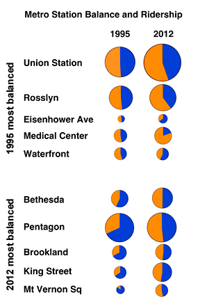
Circle area size represents AM peak ridership.
The data for Ballston are particularly interesting. Fewer people are entering that station in the morning today than 17 years ago. Population in the area has increased, although more slowly than in the rest of the Orange Line corridor.
A more likely explanation is, again, the growing popularity of reverse commuting. Two decades ago, you got an apartment in Ballston to take Metro into DC for work; today, the attraction is the ease of getting into DC in the evening, and you’re more likely to commute by car to Tysons or Reston.
Some other close-in stations in largely residential areas have seen similar stagnation or even decline in entries in the AM peak. Cleveland Park, for example, has been essentially flat, with 2,321 morning entries in 1995 and 2,329 in 2012. Brookland’s AM peak entries have fallen from 2,172 to 2,075. But these stations, unlike Ballston, have lost population within walking distance, so it’s hard to judge what role reverse auto commuting played.