What was up with the one-way Orange-Blue?
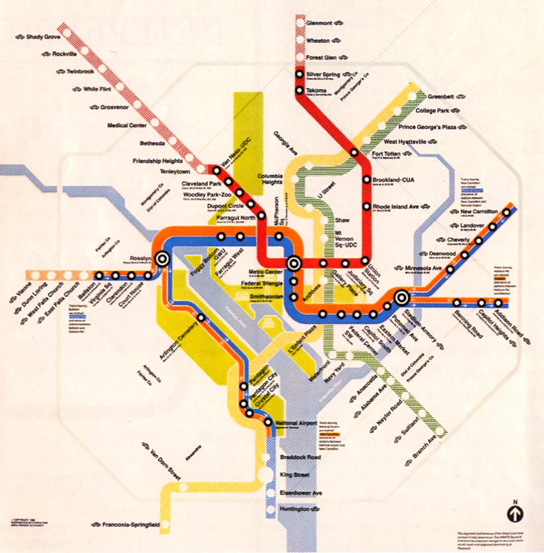
Metro map, 1982.
I was just looking again at the 1982 Metro map I posted this morning. After the Orange and Blue lines split at Rosslyn and Stadium-Armory, each branch is Orange one way, Blue the other.
Why did they do this? If a train leaves National Airport heading north, it’ll be Orange. Then Orange trains go to New Carrollton. When it turns around, it’ll be Blue, and Blue trains go to National Airport. So you have one service going from National to New Carrollton, and another from Ballston to Addison Road.
Other than the fact that the termini are flipped around from what we have today, why not simply have one color for National-New Carrollton and another color for Ballston-Addison? The whole Orange in, Blue out thing seems pointless and completely nonsensical. What am I missing?
Update: OK, thanks to commenters I think we’ve explained it. From any station, the Blue trains are headed toward National and Addison, which is where Blue trains go today, and the Orange trains are headed toward Ballston and New Carrollton, which is where those go today. So this gets riders used to boarding the correct color train to go from the central business district to an outlying area. However, they still board the wrong color train heading inbound, but from there, there are fewer choices and less opportunity for error.