More fun with graphs
Continuing the discussion of Washingtonian transit exceptionalism from here and here, commenter SamZ posted this graph comparing the amount of non-car commuting in each region between the “transit zone” (within a half mile of transit) to the rest of the region.
Our transit zone commuters ride transit, bike and walk more than in other cities. There’s also a greater split between the transit zone and the rest (though bicycle commuting is on the rise in Fairfax too).
Image by Reconnecting America.
On the lighter side, commenter Dave Murphy posted this amusing graph:
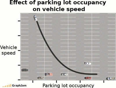
Image by GraphJam.