This map lets you watch transit in action across the world in real time
This is a zoomed-out view of the Live Map 24 tool. Image by Veridict used with permission.
Have you ever watched a colony of ants moving around in neat lines, one ant after another, each with their own specific tasks? Some ants are bringing food back to the colony, while others are watching out for predators. Live Map 24 is like that, except instead of ants moving in the woods, it’s trains, buses, and ferries moving along city streets.
Live Map 24 is made by Veridict, an analytics company, and displays public transportation modes across the world in real-time. In the DC region, buses and the Metro dominate the landscape, with some light rail in Baltimore and a few Amtrak and MARC trains around the region.
Screen shot from Live Map 24. Image by Veridict used with permission.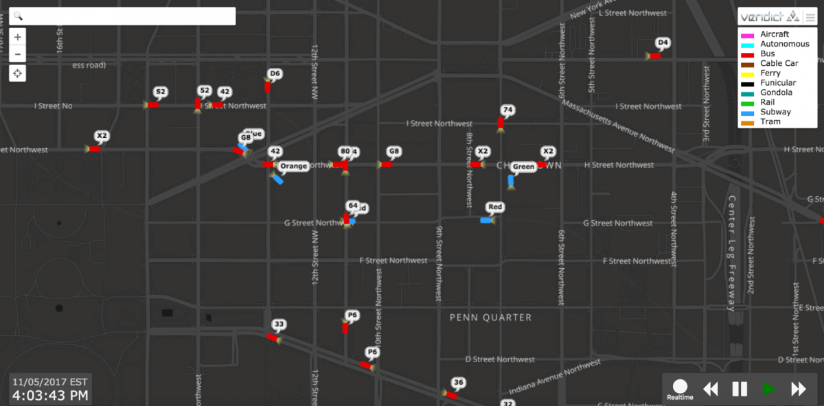
The map does more than show amusing little rectangles moseying along a grid. It also provides real-time transit information. For example, zooming into DC’s Chinatown shows individual bus lines and rail line color. Clicking on one of the buses reveals a timetable.
If you’re extra nerdy you can find the train or bus you’re riding on and watch it go on the map as you move–it’s surprisingly fun.
Screen shot from Live Map 24. Image by Veridict used with permission.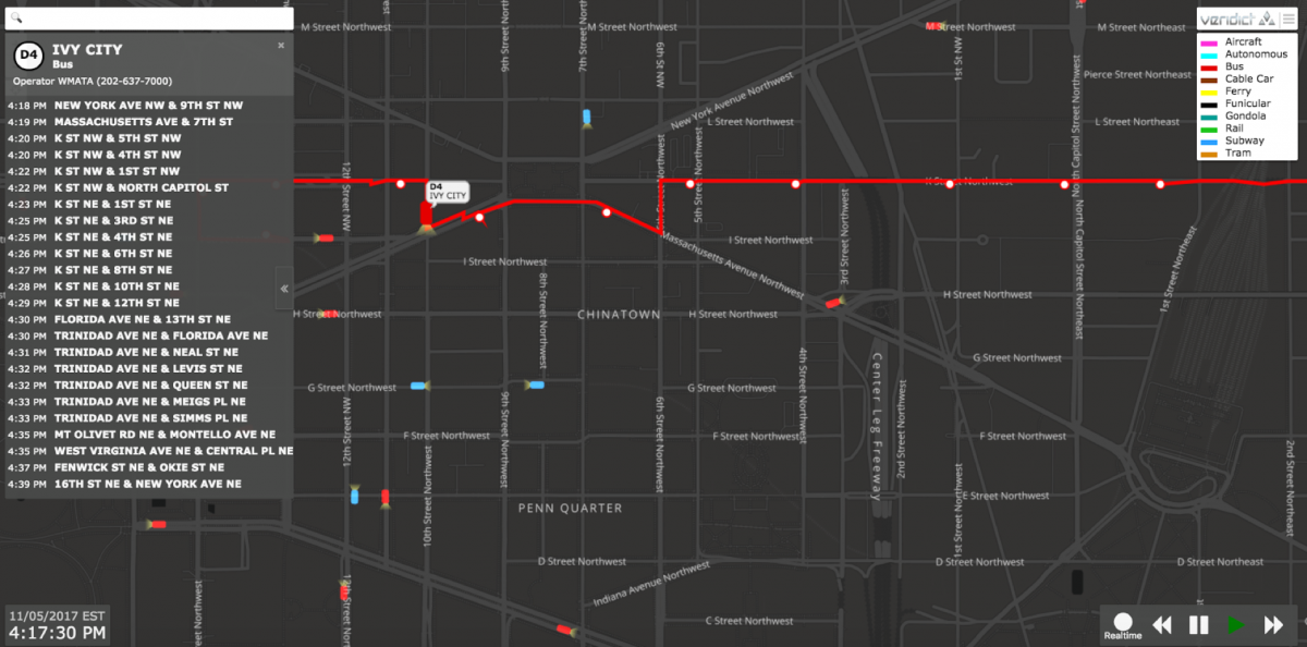
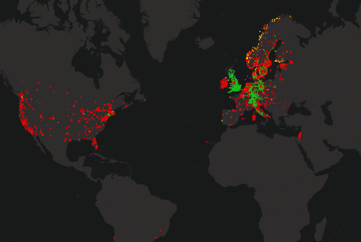
Zooming out also reveals fascinating patterns. Ferries are more numerous in New York and Seattle. You can see Norwegian Airlines’ planes as they fly from Norway to the United Kingdom. There are a lot more commuter rail cars there, too.
Zooming out also shows just how massive the United States is; public transit makes up only small splotches on the country (though data does not appear to be available for all cities). As urbanists, we desire cities with a strong public transit network and walkable communities. Looking at the country as a whole, it’s no surprise why this is quite the challenge in many parts of the country.
Of course, there's some missing data too. For example, there's no sign of the riverboats in our area. Swaths of the map that have robust transit systems look dark (like most of the continents of South America and Africa) because they're not public or because they simply don't have open real-time data feeds online to pull from.
Have you tried the map? What do you notice about transit patterns in the DC region or in other cities?