DC’s Comprehensive Plan, a document we use today, preserves the racial segregation of our past
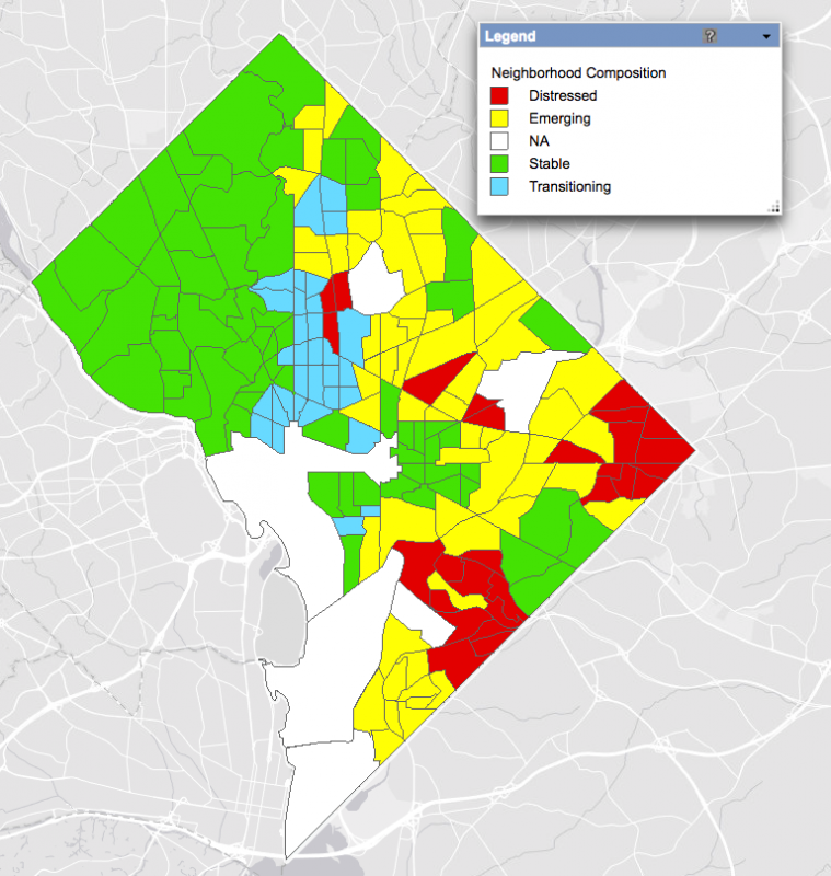
To see this map, click it, then select Layers, then Demographic, then Neighborhood Composition. Image by Office of Planning.
In its current planning documents, DC classifies neighborhoods in a way that looks disturbingly similar to “redlining” maps from the past. These maps used the racial identity of residents as a key factor for determining the financial value of property and neighborhoods. By labeling large sections of DC as “stable” and creating policies that insulate these areas, the city appears to be preserving residential segregation.
What's the Comp Plan?
A document called the Comprehensive Plan guides growth and change in the District. Zoning changes and development decisions are required to be consistent with the plan. The DC Council approves the plan and regular amendments to it, and is responsible for passing legislation to implement it.
In addition to helping shape DC’s physical landscape, the Comp Plan addresses economic development, housing, the environment, historic preservation, and several other elements. The city is currently updating the document, with the Office of Planning (OP) accepting proposals for amendments until June 23.
The guiding vision for the Comp Plan is “Planning an Inclusive City.” That means a place where everyone gets equal access to housing, transit, parks, and other urban resources, and where “every member of the community feels welcome wherever they are in the city.”
Unfortunately, however, the Comp Plan also divides the District into categories that look a whole lot like relics of our city's exclusionary past. As a local historian interested in how land use policy has served to segregate and displace black Washingtonians, I was alarmed to discover that the Comp Plan includes language so similar to what appears in 1930s redlining maps.
What this map is, and what the colors mean
In the glossary of the Comprehensive Plan, the Office of Planning divides the city into into four categories— “distressed,” “emerging,” “transitioning,” and “stable”—the labels serving as a basis for decisions about future development in the District. These designations represent a range of indicators, including income, home values and sales, school performance, crime rates, poverty rates, education levels, and building permit activity, among others.
- “Distressed” neighborhoods have “high concentrations of poverty, crime, negative social conditions, and little or no private investment.”
- “Emerging” neighborhoods are said to have “moderately positive indicators of health and well being,” and to be “under-performing relative to their market potential.”
- “Transitional” neighborhoods “are revitalizing rapidly, with high paced home sales, fast-rising property values,” and a high risk of displacement for residents.”
- “Stable” neighborhoods are ones where income, home values, and the other factors listed above exceed levels elsewhere in the city. They include many of DC's most attractive residential areas, which the Comp Plan says should be protected from further development “through zoning and other means to ensure that neighborhood character is preserved and enhanced.”
The problem is that “stable” is the label used for all of the largely segregated and economically exclusive neighborhoods west of Rock Creek Park. In other words, the Comp Plan typically equates stability with areas that are unaffordable and largely inaccessible to many of the city’s residents. Areas in which only high-income people can afford to live should not be considered untouchable in a healthy urban environment, especially when the Comp Plan itself says DC should be inclusive.
Meanwhile, much of the eastern half of the city—the location of racially mixed and largely black neighborhoods—are described as “emerging.” These are the areas considered ripest for investment and redevelopment, activities that too often precipitate displacement. The fact that “emerging” neighborhoods are defined as underperforming relative to their market potential makes it pretty clear that this is where the city thinks development should happen.
Notably, the two major sections the Comp Plan calls “distressed” encompass areas with the highest concentration of black residents, while “transitioning” defines the increasingly white neighborhoods just east of Rock Creek Park.
To see this map, click it, then select Layers, then Demographic, then Estimated Black Population - 2010. Image by Office of Planning.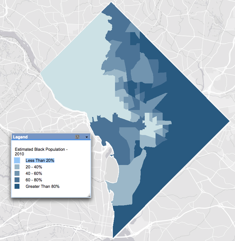
What redlining maps were
The theory that the presence of African Americans devalued neighborhoods began to take hold at the same time the real estate industry started to emerge in the early 1900s. The federal government later institutionalized residential segregation by designating areas where black people lived to be off-limits for home loans, making the decline of property values a self-fulfilling prophecy.
Based on surveys conducted by local real estate officials, the federal Home Owners' Loan Corporation (HOLC) made maps to illustrate the financial risk of insuring mortgages. In this 1937 map of Baltimore, black-occupied neighborhoods were colored red, for “hazardous.”
No one has been able to turn up a HOLC map for DC (it is missing from the National Archives' collection), but racially restrictive covenants were common here. Racial restrictions in property deeds, which legally barred black people from entire neighborhoods until 1948, laid the foundation for redlining, meaning that regardless of whether such a map was produced for DC, the same patterns existed. And the categories that DC’s Comprehensive Plan uses today aren’t all that different from those that HOLC assigned to Baltimore and other cities in the 1930s. Ultimately, they reinforce the economic valuation of neighborhoods based on their occupants' race.
DC's “distressed” neighborhoods may be unlikely to experience further disinvestment at this stage of the city's rapid redevelopment and gentrification, but the fact that these are the same areas likely to have been colored red for “hazardous” in the 1930s is, in itself, distressing.
Let's instead consider how hazardous it is that our most “stable” neighborhoods also remain some of our most segregated.