This Metro map morphs from the familiar map to a geographic version
Image by Peter Dovak used with permission.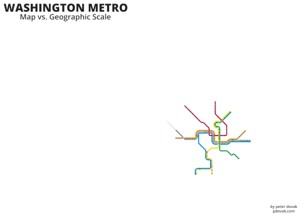
Most people know the Metro map is not an accurate representation of geography, but how different is it? This animation, This animation by GGWash contributor and graphic designer extraordinaire Peter Dovak, flips between the traditional diagrammatic Metro map and a geographic analogue to make it clear.
You can see how stations toward the ends of the lines are much farther apart than in the center, how very far Shady Grove and especially the future Silver Line second phase are; how different the distance is from King Street to Franconia-Springfield versus Huntington; and how the Red Line's western end is so much more north-south than the 45-degree northwest-southeast of the familiar map.
All transit maps distort geography to some degree. Even New York's subway map, which is less of a stylized diagram, greatly widens Manhattan to separate the north-south lines as well as other distortions. If transit maps were faithful to geography, they would be scarecely readable and/or would need clumsy call-outs. The diagrammatic versions make it easy to see which line to take, where to transfer, and how many stops to wait for; geography is less important. But it's still fascinating to see how the map corresponds to actual geography.
Also check out related animations for New York, London, and Paris.
What else do you notice?