How much of a workout would you get walking from one Metro stop to the next? This map shows you.
How realistic would it be for you to walk rather than take the Metro? This map of the DC Metro system includes number of miles between stations, how long it’d take to walk that distance, and the number of calories you’d burn if you did:
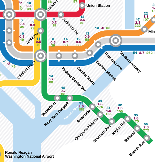
A zoomed in look at Wells + Associates’ map. Here, you can see the short distances between some stations and the longer ones between others. Images from Wells + Associates.
The map, created by Wells + Associates, with data from Google Maps, tells commuters just how realistic it might be to leave a station and walk rather than take a train.
Between each station, there are three numbers: the first one, which is blue, says how many minutes it’d take to walk; the middle one, which is purple, says the distance between them in miles; and the third one, which is green, says how many calories you’d burn if you made the walk.
If you’re using Metro in downtown DC or in Arlington, where many stations are less than two miles apart,making the final leg your commute by foot or bike may just save you time, reduce stress, and burn off a few calories before you settle down at your desk.
In other places, like on the far east end of the Green Line where the Suitland and Branch Avenue stations are 2.8 miles and a 55 minute walk apart, and on the west end of the Silver Line, where the distance between the Spring Hill and Wiehle-Reston East stations is a whopping 6.9 miles apart, that isn’t exactly a realistic choice.
In cases like these, if driving isn’t an option, biking or waiting might be the only feasible option.
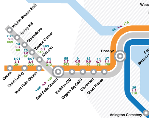
Would you be less likely to wait out that final 8, 10, or 20 minutes for the next train if you knew your destination was just a few blocks away?