The Booth Map: Redesigning WMATA’s map
In 2007 graphic design firm KICK famously proposed redrawing the New York subway map. The new map they produced was more straightforward and intuitive than the official subway map, but also more diagrammatic. MTA eventually dismissed the proposal, but not before considerable internet buzz. Graphic designers and transit nerds talk about it to this day.
Now, graphic designer Cameron Booth has done the same for Washington. WMATA’s existing map is one of the world’s more iconic, but it has its faults, and as Booth notes, once the Silver Line is up and running there simply won’t be room on the page to continue the current scheme. His proposal is worth discussing.
| Existing WMATA map | Future WMATA map with narrower lines |
Booth map | |
| Full map | 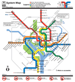 |
 |
 |
| Downtown | 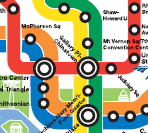 |
|
|
The Booth map has some real advantages. Instead of relying on clumsy call-out boxes for special notes, it graphically integrates all levels of peak and non-peak service. It shows MARC routes. Labels are more well-placed. It looks more up-to-date and professional.
On the other hand, Booth’s map has some real disadvantages too. First and foremost, it suffers from that most cardinal sin of transit maps: it’s too spaced out on the periphery and too crowded downtown. The whole point of using diagrams for transit maps instead of real geography is to avoid this problem, and Booth’s map is inferior to both WMATA entries in this regard. Lesser disadvantages are that the Beltway is too prominent, and that the smaller text and lines are harder to read at small scale.
Booth claims his map is more geographically accurate with regard to jurisdiction boundaries, but at best accuracy is a wash, as the lines themselves are more distorted. Shady Grove looks awfully close to the Beltway, there’s no curve at Tysons Corner, and Ballston is way too far west.
Overall, I think the Booth map is a great exercise, and offers some lessons that Metro definitely ought to adopt with its next redesign. I don’t, however, think the map is better overall, and would not suggest wholesale replacement. What do you think?
Cross-posted at BeyondDC.