See the average income of Metrorail riders by line and station
A new collection of data from Metro shows the average household income of Metrorail passengers mapped by line and station. You can see the numbers for different lines and stations, and at different times of day.
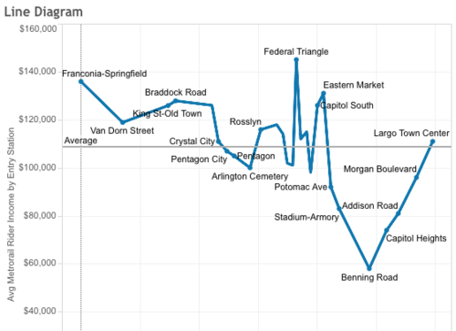
The average household income of users at each Blue Line station. Image from WMATA.
You can see the Washington region’s wide range of income levels in the data visualization, which uses data from Metro’s 2012 rider survey. This visualization is different from similar ones in that it uses self-reported data from Metrorail riders.
A high quality transit system is a key to ensuring opportunities for people of every socioeconomic status.
It’s interesting to see what patterns emerge when you toggle between different periods of the day. For instance, at my local Metro station, Columbia Heights, the average income during the AM peak is $91,000. But during midday, the average income of riders entering the station drops to $65,000, and during the PM peak it drops further to $55,000. In the evening it rises again to $75,000.
What patterns do you see in this data? Metro even allows you to download the Tableau workbook so you can play with it and create your own visualization.
Note: We updated this post to specify that the visualization shows average household incomes.