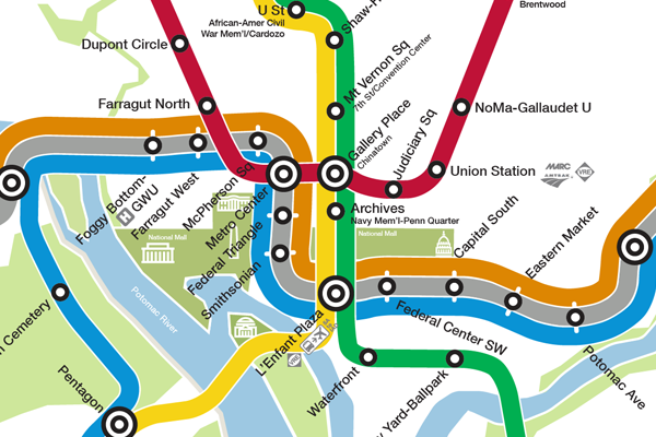
What if the new Metro map were to scale?
Graphic designer Peter Dovak has created a geographically accurate version of the new Metro map that WMATA released last week.
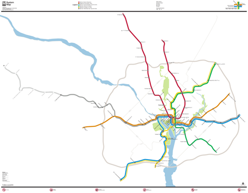
Map by Peter Dovak.
Peter’s map matches WMATA’s style as closely as possible, except it’s to scale. It looks stunningly like it could be an actual WMATA-produced map.
While this map is wonderful and fun, it also strongly illustrates why Metro opts for a more abstract official design. There’s so much empty white space in the suburbs, and the core is so cluttered, that a less accurate diagram is easier for riders to read.
See more at Peter’s website.
 Cross-posted at BeyondDC.