Frequency and real-time info help transit riders most
Photo by DCMatt on Flickr.
How can transit agencies and app developers best help people use transit, at a lower cost than adding new transit service? Two new studies suggest that real-time information, for simple trips, and service frequencies, for complex trips, can best help riders.
A study of Seattle’s OneBusAway mobile app, just released at the Transportation Research Board meeting, shows that real-time information decreases wait time by almost 20%, and decreases the amount of time riders think they are waiting by about 30%.
However, for trips involving one or more transfers, real-time information is less useful because riders don’t know exactly when they will get to the transfer point. For these trips, another study found that both novice and experienced riders benefit most from having data on the frequency of service for each line they can take.
In the DC region, travelers often can choose among many transit routes and modes. To help travelers, maps and apps display a variety of information, like the routes in a geographically accurate or diagram form, vehicle arrival times or positions, and more.
It would be extremely useful to transit users, transit agencies, and app designers to understand exactly what displayed information is really helping travelers make better choices. Fortunately, Hartwig Hochmair, now a professor at the University of Florida, designed a clever web experiment (PDF) that helps answer this very question.
For simplicity, let’s assume that travelers want to find the fastest route. Not all do; some prefer a trip where they can get a seat, or prefer the smooth ride of rails over a bus. But many do want to minimize overall travel time.
However, it’s not always simple to figure out the fastest route. Maps can’t contain all the information to decide this perfectly, and the rider usually has limited time to make a choice. So travelers quickly pick a subset of information, one of several “proxy variables,” and use it to choose a route, such as:
- Shortest total distance
- Fewest number of stops traveled
- Most linear route, heading straight toward the destination
- Fewest transfers, for less total waiting time
- Most transfer options at each station, allowing a switch to the first train in the direction of the destination
Do people choose different proxy criteria depending on how a map displays the information? Hochmair asked experiment participants to plan trips on the metro system in Vienna, Austria. That system has many interconnected lines, giving riders many choices among complex routes.
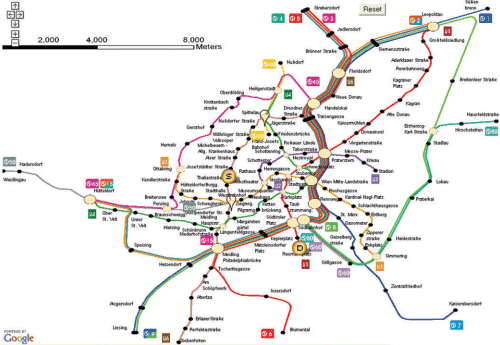
The geographic map of the Vienna U- and S-Bahn used in the experiment.
Hochmair’s participants saw 5 different displays:
- A geographically accurate map
- A diagrammatic map based on the official map
- A map showing the real-time positions of vehicles
- A map with service frequencies, showing the time between arrivals per line
- A map showing the next departure time for all lines from the starting point
He tested 35 people with varying levels of Vienna metro experience by giving them 40 route-finding problems apiece. Based on the routes chosen, he was able to use a statistical model to conclude that while people used distance information in every map, the different maps also caused people to use different proxy criteria for planning their route:
- The geographically accurate map led people to pay attention to the number of stops traveled.
- The diagrammatic map, and the map showing next departures, led people to pay more attention to the total number of transfers.
- The map showing service frequencies caused people to pay more attention to the number of transfer options at each stop.
Which of these maps is the best to help people minimize travel time? For the complex trips in Hochmair’s study, inexperienced users benefited most from having service frequencies. Meanwhile, for experienced users, service frequencies also turned out to be best, with vehicle positions second.
The study still concludes that a map with real-time information is better than a plain map. But the usefulness of real-time information decreases as the number of transfers increases, because a traveler doesn’t know exactly when they will arrive at each transfer point. For trips with more transfers, most travelers would be better off following a route where service is most frequent.
Most transit maps do not contain this information. Bus maps like WMATA’s standard map (PDF), for instance, show every line the same size and weight whether it runs once an hour or every 3-5 minutes. WMATA’s planning department did put together a map of routes with buses more frequent than 4 times per hour, and the agency should actively promote this clear and helpful tool.
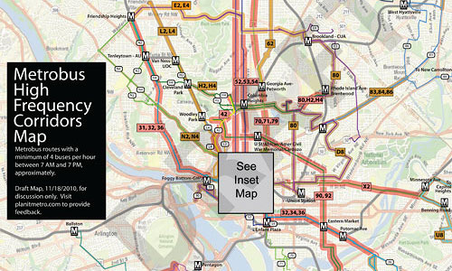
Central DC section of 15-minute Metrobus map. Click for full map. Image from WMATA.
A final lesson of this study is that, between different traveler preferences and the different ways travelers use information, agencies and app designers must keep the needs of different users in mind. But all can take fairly low-cost steps to help riders by making service frequency information more prominent.