Would personalized “spider maps” be useful for DC?
London has a complex network of train and bus lines, and a unique type of diagram to help people navigate them, known colloquially as the “spider map.” As part of the work at the Mobility Lab, we’re looking into generating these for the DC region, but going one step farther, and creating personalized ones for any location.

“Spider map” from Victoria Station. Click to enlarge (PDF). Image from Transport for London.
At each Tube station, a diagram like this shows each of the bus lines that travels from the immediate area. In the center, a geographically accurate map shows the nearby streets and bus stops. But instead of continuing the lines on a geographic map, which would either have to be very large or zoomed very far out, a spider map shows each line in the simplified format of the Tube diagram.
Someone trying to find a bus can therefore more easily grasp at a glance the location of that bus’s nearest stop and what neighborhoods it travels through. It’s easy to see all of the buses and their destinations, where they merge or cross, and more.
The Washington region also has a very complex bus network. The WMATA bus map is virtually unusable, partly because many lines are all the same color, but also because it’s just so intricate:
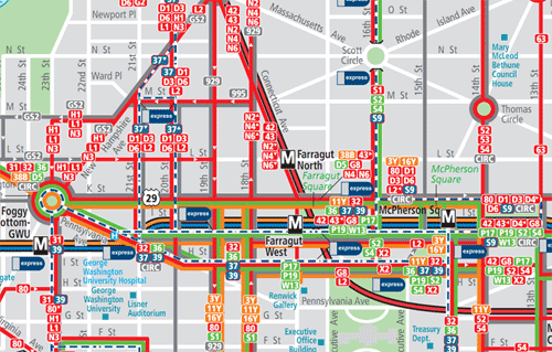
Downtown section of the DC bus map. Click for full map (PDF). Image from WMATA.
But any individual person doesn’t use all of the bus lines. You only likely use bus lines that travel near your home or work, or both. At any given time, if you’re interested in a bus, you only wants the lines that stop near your current location.
Would it be useful to have a spider map in this case? You could get a spider map centered around your home or work. It could help you understand your bus options; many residents even with good bus access often aren’t aware of bus lines that could serve their needs.
Transport for London’s maps are hand-generated by a contractor, but we wouldn’t do that. Instead, as one of the upcoming Mobility Lab projects, we’re considering writing software to automatically generate maps such as these. They might be a little less perfectly refined than one made by a human, but could center around any point instead of just a small set (Tube stations, in TfL’s case).
Or, are spider maps the wrong way to show bus information? Kerwin Datu criticized these maps, specifically their usefulness for tourists. Jarrett Walker thinks a “frequent network map” would be better (WMATA planners created one for our region).
Walker, though, actually doesn’t end up recommending doing away with spider maps. He actually just thinks spider maps shouldn’t be the only way to show the buses. He’d like to have both a frequent network map and a bus map that shows buses just for a few kilometers, the range where people are most likely to take a bus for non-commuting purposes. That map should also, Walker suggests, emphasize the most frequent services over the occasional or rush hour-only ones.
Using Walker’s suggestions to create a Washington personalized spider map, we could imagine a circle showing all roads within a 10-minute walk of the center point, and then lines showing all buses and where they go for a few miles. Frequent buses could get thicker lines than less frequent buses, and rush hour buses lighter lines than all-day buses.
Major attractions could get prominent placement. For example, what bus goes to Adams Morgan, or Georgetown, or H Street? Many people don’t know; such a map could make this clear, including which bus is most frequent and has the best span of service.
Not every map needs to serve all purposes. The standard Metrorail map is great for helping people figure out how to get from one station to another, but it is less effective at helping people know which station to use to reach a certain landmark, for example.
The purpose of this map project would be to help demystify the bus, showing each person what they need to know to understand and make use of their bus options. This should be a map that hotels could print out and hand out at the desk, or realtors could give to new home buyers. What would make such a map most useful?