Urban areas represent what cities really are. See them with this map.
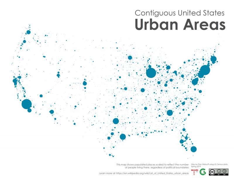
Image licensed under Creative Commons.
How do you compare the population of cities across the country, correcting for the randomness of political borders? You can't use official city populations, and metropolitan areas are only a little better.
The most apples-to-apples method is a US Census method called “urban areas,” which are clusters of development that meet a minimum population density threshold. This map shows the urban areas in the 48 contiguous states, with each dot scaled to represent the population of one urban area.
“Cities” are a terrible way to compare cities
Cities, officially, are political units with political borders. The District of Columbia is one, and what land falls inside the District's borders versus outside its borders is well-defined.
But that well-defined “city” is a completely inaccurate representation of the population cluster that is “Washington.” The built-up city, as people inside and nearby experience it, isn't defined by the political borders. Rather, it's defined by the built environment itself.
This difference is apparent all along the District's political border, where the development on the Maryland or Virginia side is virtually indistinguisable from the development on the District side.
For example in Friendship Heights. Only one side of this image is in “the city” as political borders define it, but both sides are equally urban, equally legitimate parts of the built-up region.
Western Avenue in Friendship Heights. Image by Google.
Meanwhile, this photo is 100% inside the political borders of the City of Jacksonville, Florida. It's not a park. Jacksonville's official border simply extends far out beyond the edge of development.
Literally inside the City of Jacksonville, FL. Image by Google.
Thus, what type of development is included in one city versus another is completely arbitrary. One city may include many of its suburbs (as Jacksonville does), while another may not include many of them.
If you want to compare cities to other cities, you need a method that doesn't rely on arbitary political borders.
“Metropolitan areas” are also bad
When people want to include the suburbs of a central city and describe the built-up area of a place, they often say “metro area.” Metro areas are indeed a better comparison method than official cities, but they're still bad. Metro areas are based on county borders, and thus still rely on arbitrary political lines.
This map shows the metro area boundaries, as the US Census defines them.
US metro areas, based on county borders. Image by US Census._of_the_United_States_and_Puerto_Rico,_Feb_2013.gif)
In the eastern part of the country, where counties are relatively small and relatively uniform in size, they provide a decently reliable base unit. But look at the west, where counties are often larger than entire eastern states.
The Riverside, CA metro area formally extends all the way to the Arizona state border, through more than 100 miles of virtually empty desert. Reno, NV—a community realistically about the same size as Winston-Salem, NC—formally extends 170 miles north to the Oregon border.
It's 160 miles from the District of Columbia south to the North Carolina border, through the entire state of Virginia. Imagine defining the Washington metro area as going all the way to North Carolina, because one county extends that far.
It's less of a problem for Reno than for Washington, because not very many people live in that 170 mile long county, except those living near Reno. But it still introduces a level of invalidity to comparing metro areas across the country.
“Urban areas” solve this problem by not relying on political borders
Enter the “urban area,” contiguous clusters with a population density above 1,000 people per square mile. Being defined based on population density rather than political borders means urbanized areas are a closer measure for the true size of any city. They measure what's really there, rather than where governments drew arbitrary lines centuries ago.
Urban areas aren't completely perfect either. For example, when two urban areas meet at each other's edges it's not always clear how to treat them. And the neighborhood-sized census tracts that the Census uses as the base geography from which to calculate population density to define urban areas may not be completely objective; the Census usually uses things like streets and natural features as the borders between tracts, but it's not always clear why one street makes up the border versus another street nearby, and sometimes political borders do find their way into census tract boundaries.
But by and large, urban areas are the most objective and reliable way to compare the population of different US cities on an apples-to-apples basis.
What do the US urban areas tell us?
The map at the top of this post, available here in full size, shows all the urban areas in the 48 contiguous states, with each dot sized to reflect its population. The complete list is available on Wikipedia.
I left political borders and city labels off the map intentionally, so it illustrates the unadulterated pattern of urban development in the lower 48 United States.
The really large cities are easy to make out, but what stands out even more to me is the incredible mass of medium-sized cities, especially in the eastern third of the country. Places like Winston-Salem, Roanoke, Buffalo, Rochester, Sarasota, Harrisburg.
And then, the remoteness of the west, especially Nevada.
Other patterns emerge too. Freed of political borders, big cities in the Midwest seem to be aligned in two strings: One beginning in Pittsburgh and then moving northwest to Cleveland, Detroit, Chicago, and Minneapolis, with the other beginning in Pittsburgh then moving southwest to Columbus, Cincinnati, Indianapolis, Saint Louis, and Kansas City.
In the south, Atlanta looks like the supergiant black hole at the center of a galaxy, with spiral arms emanating outward towards Charlotte, Knoxville, Nashville, and Birmingham.
In the west, Salt Like City looks like the eastern anchor of corridors leading northwest to Seattle and southwest to Los Angeles. While Denver and its accompanying satellites looks plopped in the middle of nowhere, independent of any larger structures.
Looking at continental America this way, what stands out to you?
Thumbnail: Image by the author.