The way we calculate population density is wrong. Here’s what we should do instead.
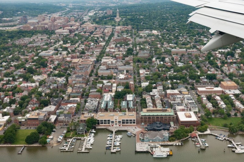
An aerial shot of Old Town Alexandria provides a view of density in the area. Image by John Sonderman licensed under Creative Commons.
When we discuss population density, we tend to talk about the average number of people per square mile. While common, this approach has substantial downsides and it can be more useful to look at the population density experienced by the average resident. Here's why this matters.
Average population density depends on arbitrary boundaries
Average population densities are easy to calculate. One simply adds up the entire population of an area, whether a neighborhood, a city, or a metro area, and divides it by the total land area.
This simplicity has led to it being the usual way densities are calculated. However, while it works well for small areas, where there is no significant variation in density, it can lead to unreasonable results for larger areas. A commonly-cited example of this is that the Los Angeles urbanized area as defined by the Census has a higher population density than the New York urbanized area, even though New York is generally understood to be a much denser city.
The two basic issues with average population density calculations are the arbitrariness of defining borders and the fact that average population density focuses on the density of the average plot of land, not the density observed by the average person.
While cities and counties have legally-defined boundaries, the boundaries one selects when comparing metro areas is largely a matter of taste.
Since these boundaries are generally set in very low-density exurban areas, the lack of a clear cutoff doesn't lead to significant uncertainty in overall population. However, since a more expansive definition will include more nearly-empty land, it can lower the average population density of the metro area significantly by increasing land area without changing population significantly.
Average population density underestimates perceived density
Average population density figures for metropolitan areas generally overvalue the importance of low-density areas. This overvaluing is responsible for the odd-seeming result that the New York metro area has a lower average density than the Los Angeles metro area.
Our intuition that the New York metro area is very dense is based on its very dense core areas, especially New York City itself and its innermost suburbs. However, its outer suburbs tend
to have fairly low densities and to be interspersed with tracts of undeveloped land.
Although the vast majority of the land area in the New York metro area consists of this low-density suburbia and exurbia, the very high densities of the dense inner parts of the area mean that most people actually live in neighborhoods with high density.
The Los Angeles metro area lacks the high-density urban core of New York city, but it also lacks the low-density outer suburbs. Because the Los Angeles area is hemmed in by mountains and desert, nearly all developable land has been developed to a moderate density. This allows the metro area to have a higher population density than the New York area, even though most people in Los Angeles live in much less dense neighborhoods than most people in New York.
Median population density as an alternative to average population density
The beneficial consequences of urban density derive much more from the density of the neighborhood where one lives or works than from the overall density of the metro area as a whole. The walkability of an area depends on the goods and services available within walking distance–roughly a mile–and transit ridership likewise depends on the population within walking distance of stops.
However, it is obviously useful to be able to compare the densities of areas larger than a single neighborhood or walkshed, since policy decisions tend to be made on the level of whole cities, counties, or states.
For these sorts of comparisons, rather than overall average population density, it is more useful to think about “median population density,” the density of the neighborhood where the average person lives.
To calculate median population density, one finds the populations and population densities of neighborhood-sized chunks–Census block groups work well for this purpose–of an area, order them by population density, and find the density at which fifty percent of the population lives at a higher density and fifty percent lives at a lower density.
If one wants an even better picture of what fraction of an area's population lives at a given density, you can plot population as a function of a neighborhood's density, as done by Fedor Manin for several large American metro areas.
Median population densities of DC-area jurisdictions
When I found Fedor's plots, I was a bit disappointed to see that he hadn't included the DC area in his comparisons. I decided it would be worthwhile to make such a plot, not just for the DC area as a whole but for individual jurisdictions within it.
A plot of the population density distributions of the District of Columbia, Arlington County, Alexandria, Prince George's County, Montgomery County, and Fairfax County. My Fairfax County graph includes the Cities of Falls Church and Fairfax. Image by the author.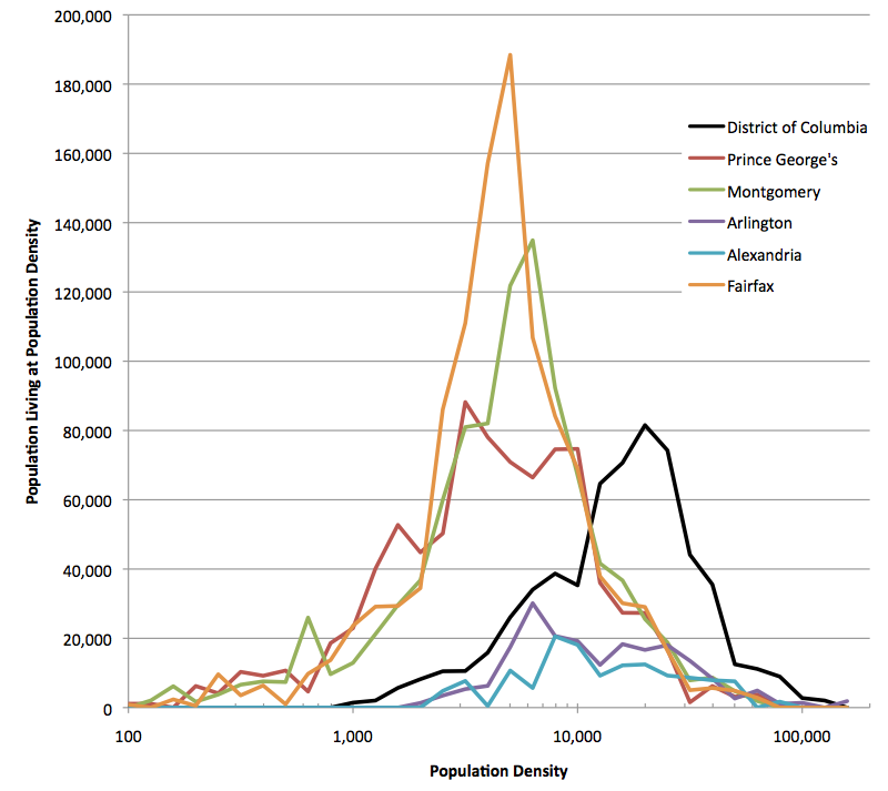
The resulting plot surprised me a bit. Although Montgomery County has made significant efforts to encourage denser development while using the Agricultural Reserve to prevent exurban sprawl, the county's median density is very similar to that of Prince George's and Fairfax Counties: all three are clustered at about 5,000 people per square mile.
The population distributions of the three large suburban counties were actually extremely similar, except that Prince George's County's population at the median 5,000 people per square mile density seems to be truncated. Most notably, all three have similar numbers of people living at higher, more urban population densities
Unsurprisingly, the population distributions of Arlington County and Alexandria are quite similar, and intermediate between the distribution for the District itself (with a median population of 20,000 people per square mile) and the large suburban counties.
For context, the District's median population density of 20,000 people per square mile is quite close to the median population density of the New York metro area as a whole, while the large suburban counties' median population densities of 5,000 people per square mile are closer to the median population density of the Boston metro area as a whole. The Los Angeles and San Francisco metro areas are in-between, with median population densities of 10,000 people per square mile.
Where is the population?
After calculating median population densities for the major jurisdictions in the DC area, I decided it would be interesting to see where the neighborhoods with those population densities are. I made a series of maps of Census block groups with population densities of 5,000 people per square mile (the median population density of the large suburban counties), 8,000 people per square mile (which Jarret Walker suggests in Human Transit as the minimum population density where increasing density increases transit ridership), and 20,000 people per square mile (the median population area of the District, and of the New York metro area as a whole).
Census block groups in the DC area with population densities of at least 5,000 people per square mile are shown in shades of orange. Federal property is shown in green. 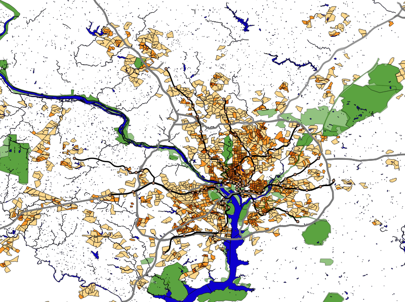
The 5,000 people per square mile map shows interesting differences between the three large suburban counties. While nearly all of the District and of Arlington and Alexandria have this population density, most of the land in the large suburban counties do not.
In the case of Montgomery County, moderate population density is largely concentrated inside the Beltway, along Veirs Mill Road, and in Gaithersburg and Germantown.
In Prince George's County, on the other hand, almost all of the moderate population density tracts are within the Beltway, though there is a medium-sized cluster in Laurel and a few small clusters in Largo, Bowie, and Upper Marlboro.
Fairfax County shows a much more dispersed pattern of moderately dense areas; they seem to be spread almost at random throughout the County, with intervening large tracts of low-density land.
Census block groups in the DC area with population densities of at least 8,000 people per square mile are shown in shades of orange. Federal property is shown in green. 
The 8,000 people per square mile map shows a similar pattern, although the areas shown are more concentrated in the vicinity of the Beltway. This map helps one see the importance of the Purple Line: the area between the Silver Spring and College Park Metro stations has one of the largest stretches of tracts at this density.
The 8,000 people per square mile map also helps show some of the problems with the routes of certain Metro lines. In particular, the Blue line in Fairfax County runs just south of a high population density area in order to use an existing railroad right of way.
Likewise, the Orange Line in Prince George's County similarly follows the Northeast Corridor through a low-density industrial zone wile missing denser areas to both the south and north. The Green Line's southern end doesn't just thread a path between denser areas in southern Prince George's County, but manages to thread a route in between two denser neighborhoods in Southeast DC as well.
Census block groups in the DC area with population densities of at least 20,000 people per square mile are shown in shades of orange. Federal property is shown in green. 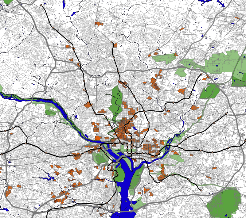
Finally, at 20,000 people per square mile–the median density of the New York area–we find that most high density areas are in DC along the Green Line north of downtown and in the area east of the Capitol and west of the Anacostia. Significant suburban areas at this density are mainly found in Virginia along the Rosslyn-Balston corridor and along I-395, but they are also found along New Hampshire Avenue north of University Boulevard in Maryland, and in Friendship Heights and downtown Silver Spring.