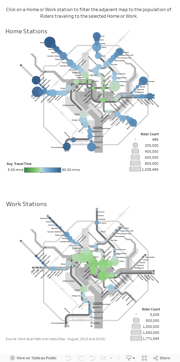
These interactive maps show how and where people travel on Metro

A Metrorail train arriving at Metro Center, bound for Shady Grove. Image by Beau Finley used with permission.
Maybe you’re new to the District or thinking of moving, changing jobs and wondering which Metro route is quickest to your office, or simply interested in broader ridership patterns, like where people using your home Metrorail station commute to work. These interactive maps I made will show you how people use the system.
I used WMATA's ridership data to identify “Home” and “Work” stations based on individual ridership patterns. If a commuter leaves one station most mornings and returns to the same station in the afternoon, then this is their “Home” station. Their “Work” station is where they traveled to in the morning and left from in the afternoon.
They only display data for persons with obvious and consistent Home and Work stations. To achieve this, I dropped the majority of trips and riders, including, for example, commuters who stopped for happy hour at a different station from Home, and those taking Metrorail to two jobs with different Work stations.
Because the original WMATA data set was so large, my methodology caught plenty of round-trip Home/Work commuters, with a high probability that considered riders live and work near identified stations. Further, I counted riders and their trips on a weekly basis, so if I lost someone to happy hour one week, they weren’t eliminated forever.
On the following maps, you can explore different Home and Work station combinations. You can hover over stations for summary stats and fares, or click to select a Home or Work station and the adjacent map will display summary information about specific Home/Work station pairs.
You may notice tiny crosses at some stations. We'll talk more about their significance later.
Here are some trends I saw
Downtown DC is densely populated with Metro stations. If you work downtown, it’s likely there’s more than one Work station within walking distance to your office. Usually, commuters pick whatever station is on the same line as their Home station.
Farragut West and Farragut North are only separated by a three-minute walk, but they’re located on different lines. Clicking between these Work stations reveals Farragut North serves mostly riders coming from the north on the Red Line, while Farragut West serves the other three cardinal directions on the Orange, Silver, and Blue Lines.
Interestingly, travel times to Farragut West and Farragut North from the southern section of the Green Line only differ by about a minute and fares are the same. The trip to Farragut North is shorter in all cases. Yet, more southern Green Line riders choose Farragut West. Oh, the time lost!
Whether traveling to Farragut West or North, southern Green Line commuters need to make one transfer. With more choosing Farragut West, riders appear to prefer transferring earlier (at L’Enfant Plaza) rather than later (at Gallery Place-Chinatown).
Moving away from Downtown to where stations are located further apart, it’s harder for riders to choose Work stations convenient to Home. On the interactive maps above, if you select Work stations moving away from Downtown, say Foggy Bottom compared to Farragut West or Dupont Circle compared to Farragut North, the distribution of Home stations becomes more evenly distributed throughout the system.
Crosses show short trips where Metro isn't the best travel option
Crosses appear for stations that are a short distance apart but have relatively long Metrorail trip times (or what I call a high T/D Ratio). If you’re traveling between one of these station pairs, it probably makes sense to walk, bike or bus instead of taking Metrorail. It doesn't consider terrain (like bodies of water) that may in fact make Metrorail the best travel option.
Click on Farragut North on the Work Stations map and you’ll see that nearly twice as many riders with Home Georgia Avenue-Petworth are traveling to Farragut North, compared to riders from Home Columbia Heights.
The data we have suggests there would be more riders living in Columbia Heights who work around Farragut North than in Petworth. Supporting this assumption, 2016 Metrorail survey data indicates that the income of riders who live in Columbia Heights is closer to the income of riders who work in Farragut North than riders who live in Petworth. Also, there are more total Home riders at Columbia Heights compared to Georgia Avenue-Petworth.
But it appears that many Columbia Heights Home commuters are choosing a transportation method other than Metrorail to commute to their jobs near Farragut North, hence the cross. It’s not a coincidence: Google bike time between the Columbia Heights and Farragut North stations is about 5 minutes quicker than the average Metrorail commute time, while the bike time from Georgia Avenue-Petworth to Farragut North is identical to the Metrorail travel time.
Trips per Week
As the T/D Ratio between stations increases, other methods of transportation from home to work become more appealing. This makes sense theoretically, but it’s still cool to see that it’s backed by observable data.
The graph below indicates that riders rely on Metrorail fewer days per week as the T/D Ratio increases. I think it’s safe to assume that riders at the higher ratios are replacing their Metrorail commute with other methods of transportation, rather than simply working less.
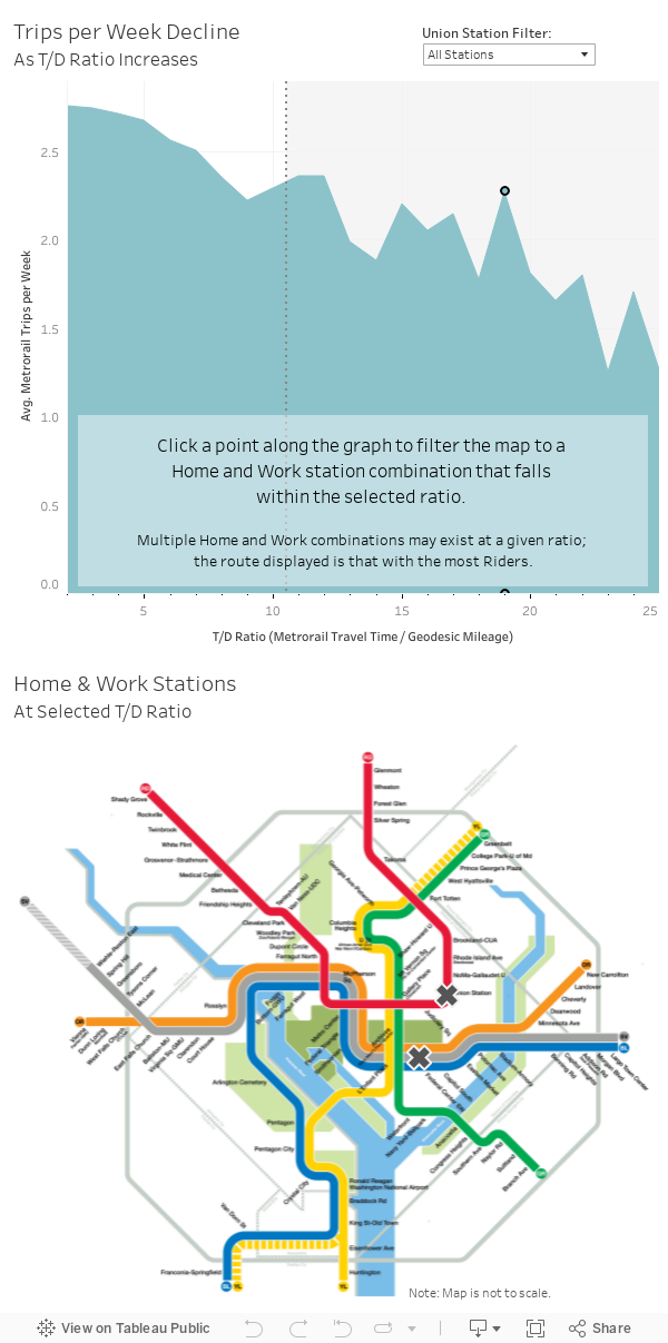
Average trips per week across all Home/Work station pairs are likely underestimated, given the strict methodology summarized above. Basically, if a Rider took more than one additional trip besides their qualifying Home/Work trip during a given day, that day was excluded from weekly averages.
Select the “Union Station Filter” above the graphic displays. You’ll notice that some of the larger counter-trend spikes disappear when Union Station “Home” riders are filtered out.
As displayed in the first set of maps, Union Station is the second largest Home station (Shady Grove is first). Many Union Station Home riders are likely arriving at Union Station on commuter or Amtrak trains from outside the District.
It makes sense that these riders are less willing to substitute another method of transportation for their Metrorail commute. Regional transit delivers these riders directly into Union Station, so they don’t have to leave the building to catch the Metro. And, bike accessibility is more challenging for these commuters (though not impossible, thanks to Capital Bikeshare and bike storage available aboard MARC trains).
I hope you enjoy browsing. Let me know if you find anything interesting!