Compare life expectancies in places across the country with this interactive map
Life expectancies in the United States have become extremely divergent depending on geography. Image by University of Washington.
Life expectancies in Washington, DC, and several other major cities along the eastern seaboard are lower than those in the surrounding counties. You can see this in new interactive maps showing mortality rates and life expectancies in every county across the US, recently released by the University of Washington's Institute for Health Metrics and Evaluation.
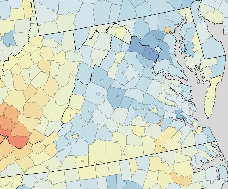
Looking at the map, you can see a number of “holes” in metropolitan areas, where largely urban counties have significantly lower life expectancies than the surrounding areas that are more suburban.
A lot of recent news has focused on the stagnant life expectancies in rural, white America, where often, life expectancy has not risen like most of the country. But less attention has been paid to urban areas like DC, which on these maps looks a lot more like West Virginia or Kentucky than nearby Maryland or Virginia. Much like these states, DC's lower life expectancy likely may have a connection to higher poverty rates.
DC's life expectancy is 76.86 years. That's 2.22 years below the national average, a span that can indicate a huge difference in the quality of life within communities. Luckily, DC has seen enormous progress during the last 35 years: where the nation's life expectancy increased by 5.33 years during the time period studied, DC's expectancy increased a whopping 8.7 years.
Cities where life expectancy falls behind
Comparing DC to states is sometimes misleading because since it is entirely urban, its characteristics are fundamentally different from any state. Even comparing DC to counties can be problematic sometimes, since counties also often include suburban places in addition to the principal city. To get the best comparisons possible, I looked at a handful of counties that are more or less contiguous with the principal city within a metropolitan area.
Many large cities in the Mid-Atlantic have notably lower life expectancies than nearby suburban places. Image by University of Washington, with additions by the author.
The map shows that other cities in the Mid-Atlantic, such as Philadelphia, Baltimore, and Richmond also lag behind on life expectancy.
The data also indicate DC could be doing more in comparison to some other cities. One feature of the map is that it allows you to compare data from every year since 1980. In 1980, a number of major cities also lagged behind the national average in terms of life expectancy. Since that time, however, many have drastically improved.
San Francisco, Suffolk County, Massachusetts (which contains Boston), and four of New York City's five boroughs have gone from having below the national average to above it. Only the Bronx, which has a much higher poverty rate than DC, has a life expectancy below the national average among New York City's boroughs. In other words, DC's life expectancy gains have been impressive, but it still lags behind some of its peers.
What this means
Healthcare, urban decay, and the rural-urban divide have all been hot political issues recently, so I think adding some nuance in this debate is important. DC is not some sort of post-apocalyptic urban landscape. In fact, in a number of ways, the city has excellent indicators in terms of quality of life, including high median household income and extensive health insurance coverage.
Another point to note is that there appears to be a link between life expectancies and poverty. Therefore, it's no surprise that DC and other inner cities lag behind suburban counties. Also, DC could be doing far worse, like Baltimore and many underdeveloped rural areas where the healthcare situation is particularly dire. Finally, there are not many combined city-counties in the US to compare in this map, so there are probably many other cities not identified here that have below-average life expectancies.
On a positive note, many places just outside of DC have very impressive life expectancies. Virginia and Maryland, like most southern states, had below-average life expectancy in 1980, but today they're above the national average. Fairfax County in particular stands out as having one of the highest life expectancies in the nation. At 83.73, its average is nearly on par with the top countries on earth.
What else do you notice about this map? How can cities improve their life expectancies?