A simpler design will strengthen the Bond at Tenley
A building proposed for Tenleytown deserves praise for putting density in the right spot, but its design is too fractured to contribute to the character of Tenleytown. Although the building fills the majority of the lot and is lined with retail, it is neither an interesting work of architecture nor a quiet background building.
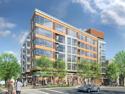
Douglas Development’s planned building at Brandywine and Wisconsin, NW.
The Bond at Tenley suffers from overcomposition. In order to break up the bulk, the architects at Shalom Baranes and Associates used large-scale overlapping conceptual volumes to break down the sense that the building is a single, solid object. These shapes mostly refer to differences in the building’s urban context, like the angles between streets. Baranes then intersected and manipulated them into each other in order to diminish the presence of the building’s mass.
However, at smaller scales and different locations, the same figures repeat. Blocks and grids overlap and glance by each other, repeating the same general patterns. Rather than using the shifts of scale to contradict figures or develop simplicity, the architects jostled oversized parts together.
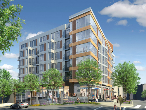
PUD filings and renderings on the project’s website show the façades principally forming a thick bar along Wisconsin Avenue. From this block, a pane of gray metal splits out to match the north-south orientation of the city’s grid and the Brandywine Street façade.
By itself, the scissor neatly registers the odd angle formed between the old Georgetown Pike and the city’s grid, while opening up to the street. But then there’s the brick elevator tower and a separate set of bay windows and the parapet, and a dozen different windows.
But that’s not it. The retail strip is articulated as entirely separate from the top of the building, weakening the relationship of the upper stories to the street. A second color of terracotta runs up the middle of the Wisconsin side, implying another, imaginary volume. Then, there are several tiny balconies protruding from the front, some of which are created by the formal moves, and others seem arbitrary. A look at the floorplans reveals a tortured façade that generally adds up to nothing in particular.
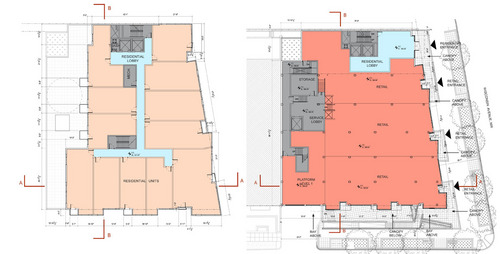
Typical residential plan at right, ground floor at left.
With all of these inflections, what do any of them mean? What part of the context or urban form does the building highlight? A more limited number of operations, with a greater depth of detail, would produce a better environment for passers-by. A building with more depth would stand on its own, even as other buildings fill up the neighboring lots and residents become inured to its presence.
Consider the difference between the sounds of two popular summer pastimes: crashing waves and fireworks. One is a repetitive, muffled noise with numerous subtleties, such that the slightest change in timing can make you hold your breath. The other is loud, arranged for variety and effect, and very, very loud. Worse, Baranes’ design is like a fireworks show where every explosion is meant to drown out the noise of every other explosion, so you can’t pin a boom to a flash or react to one before the other. Which one would you rather live in?
It’s not entirely fair to pick on this building, but it is representative of the city’s reputation. When national publications criticize Washington for its conservatism, they are not talking about the traditionalist works. They are talking about the endless formalized reference to context, uncommitted postmodernism, and the high-end banal glass. The plaid grid of featureless panels is so common in DC buildings, one could call it DC’s “official” façade treatment, the architectural equivalent of the Rickey.
However, the trend towards something more lively is already embedded in the design. The architects have called for a terracotta rainscreen for the Wisconsin Avenue façade. The systems used allow for more variety and greater sustainability. Baranes have already successfully used this kind of cladding at Waterfront Station, in Southwest DC. On a smaller project like this one, they could be more experimental with how these small, ceramic panels add to the experience of passers-by.
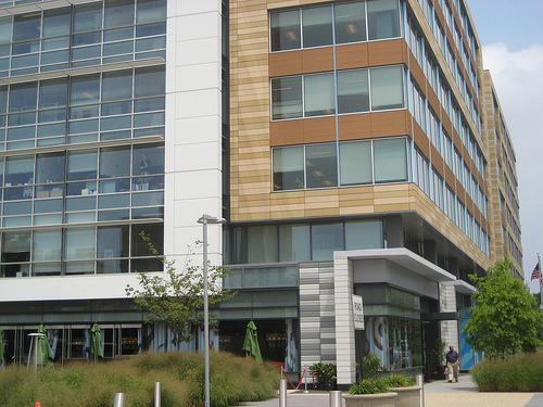
Two examples of a rainscreen at Waterfront Station. Photo by Bwalsh on Flickr.
The design of this particular building is important, because it will set the tone for the coming development in this neighborhood, as it diversifies and intensifies. More generally, the building represents a particular fixation of Washington architects: design not to meet context, but originating in the various shapes of buildings around it. SBA is one of the A-list architecture firms of the DC area, and already has a presence in Tenleytown, the excellent Cityline. A clean design that develops complexity without ostentatiousness is entirely possible.
If Tenleytown is to look different from downtown, this project can start to make the distinction. This is the first building of a coming regeneration. The importance of setting the tone is important. Tenleytown needs transit-oriented development with enough cohesion and activity to maintain and grow its identity. Simply deferring to the mediocre context will not develop the neighborhood, but merely perpetuate the present state in nicer materials.
Rather than use its influence to oppose all design, ANC 3E and the Tenleytown community should work with the developer to produce a better design, one with rhythms and scale that relate to the street and surroundings while bringing something new and vital to the area.
Cross-posted at цarьchitect.