Plans for renovating the MLK Library have changed to meet preservation standards
Late last month, plans to renovate DC’s downtown library got a key approval from the District’s Historic Preservation Review Board. The overall design approach is the same, but the details have changed.
Current design for the MLK Library. Image from DCPL.
The HPRB designates buildings as landmarks and reviews potential alterations to those buildings up. While divisive, the MLK Library, a modernist building completed in 1972, is registered as a national landmark.
The approved plans have changed a lot from the scheme that the design team, Mecanoo and Martinez+Johnson, won the project with. A mixed-use building was too hard to finance and the designers tweaked the plans based on community feedback. But fixing the building’s flaws within historic preservation rules has been the toughest challenge for designers, and those concerns have been the driver behind the biggest design changes.
Last Thursday’s approval is a key step for the project in terms of moving forward. The design the HPRB approved is the result of several rounds of review by HPRB, Washington’s other project review boards, DC’s professional Historic Preservation Office and the Federal Cultural Resources, or Section 106, process. But because MLK renovation poses big historic preservation questions while having little impact on the environment or federal operations, the other agencies are looking at to HPRB’s decision. That means this design is close to being final.
The design uses similar ideas as before but has a more conservative look
The 2014 competition design proposed a few open-ended alterations to the building: removing interior walls, retrofitting the façade for energy efficiency, opening up the ground floor, swapping opaque stair enclosures for transparent ones, and adding some kind of top that strongly contrasted with the historic structure.
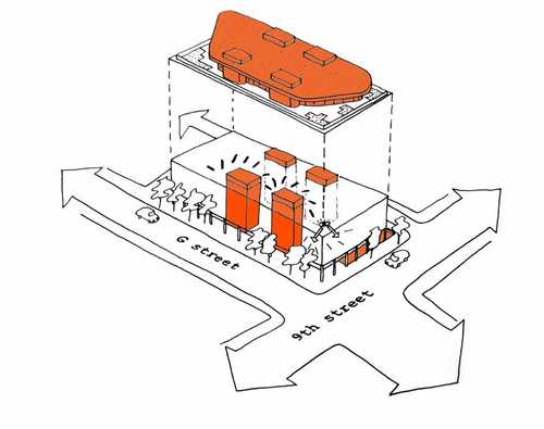
Sketch diagram of key changes: new stairs, cafe, and an addition on top. Image from DCPL/NCPC.
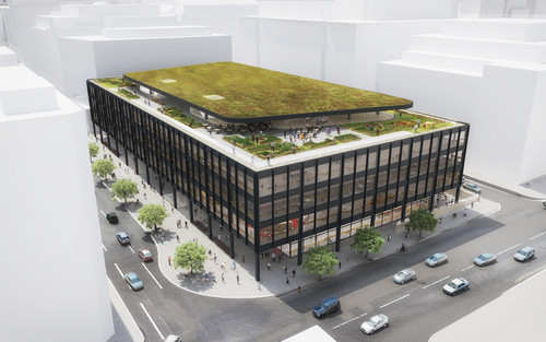
Now, the new flor takes the shapeof a black trapezoid so it’s less visible from the street. Glass skylights bring light to the basement instead of light wells. What was an oval auditorium between the fourth and fifth floors in last year, has moved to a rectangular space the center, to better riff off the geometry of the 1972 building’s original designer, Ludwig Mies van der Rohe.
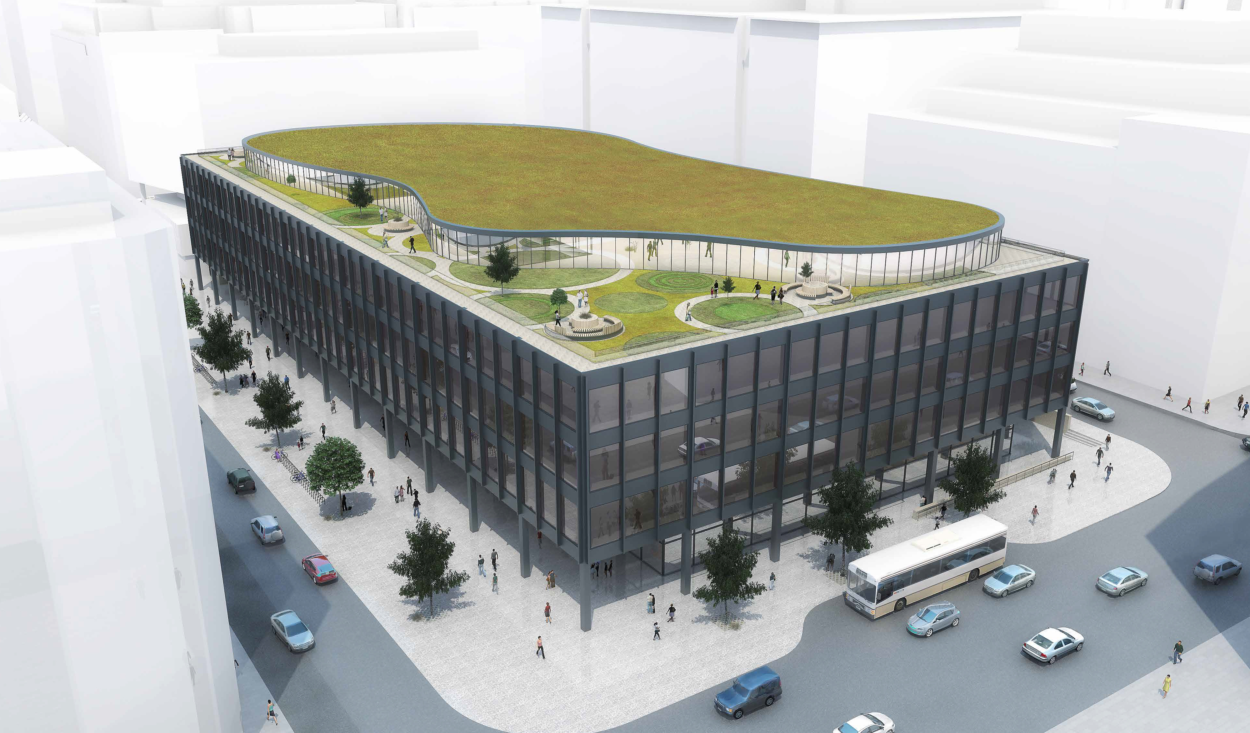
Curvilinear roof addition from last fall. Image from NCPC.
Because of this process, there were only two contentious issues for the board to rule on. They are glassy expanses that would replace tan brick walls. One is a set of doors in the center of the great hall. They lead to the first floor multipurpose space, which replaces a loading dock.
The Great Hall with glass partitions to a new assembly space. Image from DCPL.
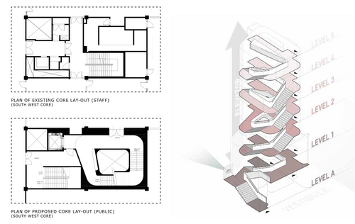
The other is a pair of glass walls separating the entry vestibule and the two stair “cores” that frame it. Moving the cores has never been controversial. When they built the library, Mies and his office designed a circulation pattern better suited to a high-rise. The designers’ goal was to move them so, as architect Tom Johnson quipped, “you don’t have to ask at the desk” how to go upstairs.
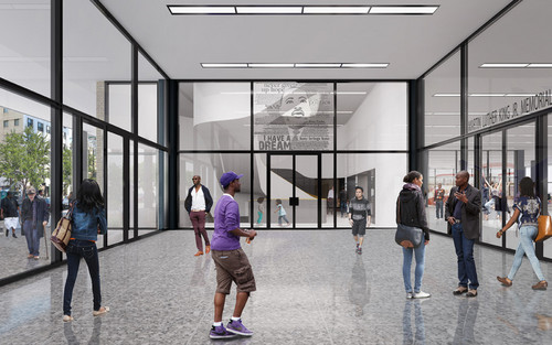
The most recent design for the lobby entryway. Image from DCPL.
The renovation design team originally wanted to demolish the core walls on all floors and replace them with semi-transparent glass ones, so the stairs would be easy to find.

The semi-transparent cores envisioned last fall. Image from DCPL.
HPO and designers couldn’t agree on how much brick to remove
The District’s Historic Preservation Office found that this approach was too extreme. They recommended instead that the renovation only remove a small recessed area in the vestibule and a few nearby metal panels. In January, HPRB steered the designers toward keeping more of the tank brick walls, especially in areas like the ground floor, that HPRB had designated as having special significance in a set of renovation guidelines.

Existing vestibule, with recessed notch. Photo by the author.
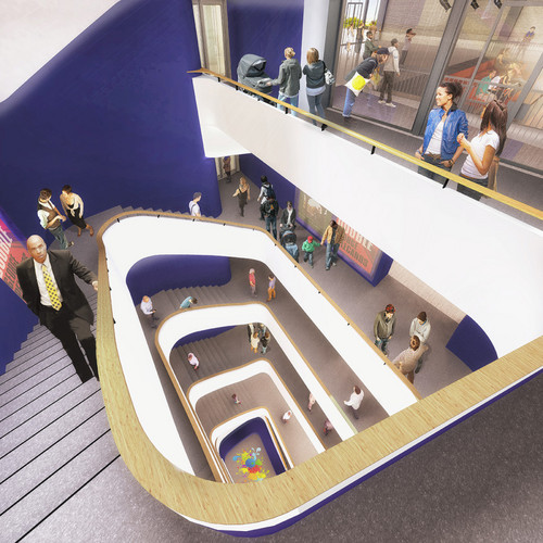
The new design for the stairwell has a central opening. Image from DCPL.
The proposed stairways now are curved spaces. Image from DCPL.
So why was HPO so opposed to removing the bricks? Public comments on the renovation frequently criticized them. In its first round of comments, HPO took what might sound like a startling stance on the entire renovation, writing “[HPO] believes that all alternatives besides A (No Action) would have an adverse affect on the building, due to loss of historic fabric.”
Preservation looks at buildings as evidence of history
“Historic fabric” means the physical substance of the building. As historic preservation law grew stronger, advocates worried that restorations often meant editing them to fit biased perspectives, effectively re-writing history. Preservationists had seen plenty of artifacts go into the dumpster.
In Old Town Alexandria, preservation mavens replaced working-class Victorian details like lamps with tonier recreations of Colonial Revival fixtures. In the UK, early agencies cut up ruins to make them fit a fanciful understanding of the Middle Ages. Architects “corrected” centuries-old monuments, demolishing irreplaceable archaeological features in the process.
To make restoration “objective,” preservationists changed their methods. They wouldn’t try to reconstruct a building’s ideal state. Instead, they’d treating sites more like records of historical changes. Preservation laws started to preserve everything within a “period of significance,” irrespective of whether it’s “good design” or flattering to history.
Demolition of the surviving parts of a historic building was discouraged. Alterations would instead have to be clearly distinguishable additions.
You can see this attitude where developers move entire buildings around to preserve them, keeping wooden windows in Columbia Heights, or storing
The federal government collected these rules into a document called the Secretary of the Interior’s Standards for the Treatment of Historic Properties. This document informs the Historic Preservation Office follows when it makes recommendations.
More importantly, the Principles of Rehabilitation are the basis of of the design guidelines created for the library. They designated those first-floor brick walls the designers want to swap for glass as particularly important.
An inviting entrance wins out
I think this all makes a lot of sense. A building can’t offer a meaningful connection to the past if its evidence tells a made-up story. And for every brilliant renovation there are a hundred bad ones proposed as well. So, the approach is conservative, with HPRB existing to allow more discretion. That’s what happened here.
What HPRB technically did was “approve and delegate,” which means that the big, conceptual issues were resolved. Their comments instruct the professional staff at HPO how to bring everyone into agreement.
Several HPRB members endorsed the design team’s proposal to make the entry more inviting by removing as much of the brick walls as the renovation team wanted. Nancy Metzger said, “I’ve always hated walking into this building… I think it should be more open.” Other members echoed her and even called for removing more brick.
But to preserve the existing building’s s spatial effects, they suggested making the glass less transparent. That way, patrons would see the activity inside, but wouldn’t assume the glass side walls are doors, and they would feel compelled to enter.
To achieve this, board members suggested adjustments to the glass through ceramic glazing called frits, shades, or metal mesh built into the glass. Board member Graham Davidson pushed the idea further, asking to replace the proposed window frames, which Mecanoo designed to match the first floor’s walls, with a flat, monolithic surface that recalled the monolithic surface of the existing brick.
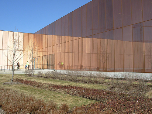
The metal embedded in the Des Moines Public Library’s walls works like a two-way mirror. From the darker interior,, you can easily look out. Photo by toddmundt on Flickr.
I think this is a very sophisticated compromise. The metal mesh option, in particular, might call back to the chain curtains used by Mies and Philip Johnson at the Four Seasons Restaurant in the Seagram Building in New York, while clearly being a technology from a different time and place. Similarly, Mies and his office used the shape of frames to tweak the sense of transparency, including at the library. This approach could permit even more removal of the first floor cores and a more inviting space in front of the building.
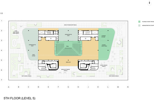
Most recent plan of the top floor. Image from DCPL.
The glassy design also follows the recommendations of the Commission of Fine Arts, which has pushed for a more radical, intellectual renovation, including a more engaging entrance. So, with the big issue resolved, the design will likely progress smoothly through the rest of Washington’s interconnected design review environment.
The prohibition against the loss of historic fabric was instituted to preserve alterations that gave insight into subsequent users’ time and place, not just the origianl. For buildings built after landmark laws came into effect might never get the chance to incorporate that kind of historical record.

A cafe would replace the garage entry on 9th street. Image from DCPL.
If the rest of the design process goes well, that may be what happens here. This alteration may be deemed significant as well, as a desire to balance preservation and vibrancy in rejuvenated downtowns.