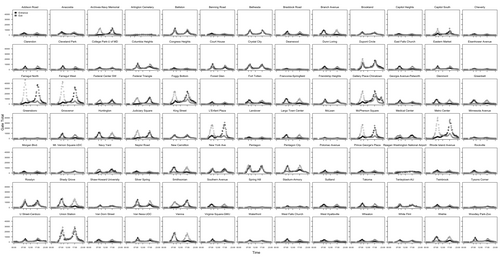
See traffic patterns at all 91 Metro stations in one glance
Those aren’t bridges — they’re graphs of how many people enter and exit each Metro station for each quarter of an hour. Reddit user BioNrd created the image using Metro’s October 2014 data, which the agency recently made available.
The darker dots are entries, the gray ones exits. You can see the stations with the greatest traffic are the ones with the dark peak in the afternoon (stations generally downtown). What else do you notice?

