New bus stop design taking shape
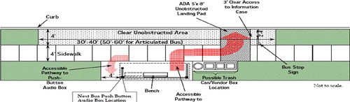
Metro is defining new standards for bus stops and shelters, including the size, spacing from curbs and corners, wheelchair accessibility, information, and spacing.
They will present the latest plans to the Board tomorrow. Metro doesn’t actually maintain bus stops; local jurisdictions do, but standards can push local jurisdictions to make bus stops relatively uniform.
The informational signs on bus stops will get a significant overhaul to make them more usable. Right now, each jurisdiction attaches “flags” for its own local buses to stops, creating a crazy patchwork (PDF). Express buses like MetroExtra or the recently revised 30s buses have their own logos as well. The new design combines Metrobuses into a single flag, extending the new color scheme of red for local and blue for express. Other buses like ART, Ride-On, etc. will have their own flags below the main one, in similar fonts but different colors and with their own logos. The bus route numbers will be very large to aid accessibility for the visually impaired.
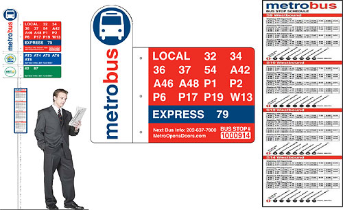
Metro also plans to improve the schedule listings in the vertical information case on the poles. Today, the cases show a schedule for the entire route. If the bus stop is not one of the major points, then the schedule doesn’t say at what time the bus is supposed to arrive, and riders have to interpolate between the nearest two points, assuming they know what these are. Instead, the new design shows only the times when a bus is supposed to show up at that particular stop. A horizontal bar along the bottom will list major destinations farther along the route, and the approximate number of minutes the bus takes to get there.
This is a huge improvement in many ways. At many bus stops, it’s too easy to get confused about which buses go to a particular destination. A bus showing up with a final destination sign of “Southern Avenue” doesn’t make this easier. That will still be a problem at some very low-ridership bus stops, since the standards recommend information cases for stops exceeding 50 boardings a day, but almost any stop which a casual rider or tourist will use in an area that’s not just their own neighborhood should exceed this threshold.
The one change that RAC members suggested when they saw this last month was to modify the grid of times. The proposed design lists the times in a table, reading horizontally. But many members noted that riders could easily assume they are supposed to read downward, like a schedule, to see arrival times; coloring alternate columns in gray, as the design does, further reinforces this incorrect conclusion.
Metro should consider a visual design, like stem and leaf schedules, that has no visual cues promoting a false reading of the list. When we see a grid, we assume that items relate to those left and right as well as those above and below. But that’s not the case here. The stem and leaf schedule, or other layouts with horizontal but not vertical continuity, would maximize usability of these schedules.
Finally, the standards recommend revising bus stop spacing to 4-5 per mile, as we discussed recently. Overall, Metro has done a nice job of improving the bus stops, and more importantly, has communicated their thoughts to the RAC, the Accessibility Advisory Committee, the Board, and others to hear input. Even if they don’t make every choice I would, we know they won’t overlook anything huge, the way the SmarTrip team did when designing the new SmartBenefits system.