Here are the busiest bus stops on 16th Street, 14th Street, and Georgia Avenue
The map shows where riders are going on Metro’s busy 16th Street, 14th Street, and Georgia Avenue lines, plus a couple of smaller routes in the same part of town.
Every circle on this map is one bus stop. The larger the circle, the more riders get on or off at that stop.
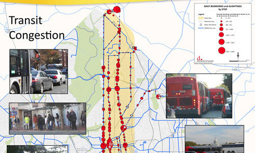
Map from DDOT.
It’s a fascinating look at transit ridership patterns in DC’s densest corridor. And it correlates strongly with land use.
Georgia Avenue is a mixed-use commercial main street for its entire length. Thus, riders are relatively evenly distributed north-to-south.
16th Street, on the other hand, is lined with lower density residential neighborhoods north of Piney Branch, but is denser than Georgia Avenue south of there. It’s not surprising then that 16th Street’s riders are clustered more heavily to the south.
14th Street looks like a hybrid between the two, with big ridership peaks south of Piney Branch but also more riders further north of Columbia Heights. 14th Street also has what appears to be the biggest single cluster, Columbia Heights itself.
DDOT produced this map as part of its North-South Corridor streetcar planning. It’s easy to see why DDOT’s streetcar plans are focusing on 14th Street to the south and Georgia Avenue to the north.
Likewise, this illustrates how a 16th Street bus lane south of Piney Branch could be particularly useful.
 Cross-posted at BeyondDC.