Travel time map distorts Metro temporally
A new experimental app shows the Metro map in a very interesting and distorted way: based on the amount of time it would take to travel to any given station from one starting point.
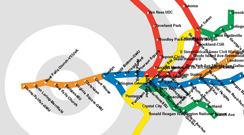
The Metro according to Ballston.
GGW contributor and urban photographer MV Jantzen emulated the Travel Time Tube Map, which shows the London Tube in the same way. Click on any station on the right side, and the map shifts. Each station still appears in the same direction from the start as in real life, but its distance changes. The longer it takes to get to that station, the farther away it appears.
Transfers also take some time, and an option lets you see what the map would look like if it considered each transfer equivalent to making extra stops. Note that if your screen is not very wide, the list of stations may wrap off the bottom edge; try making your browser window wider or less high to compensate.
Having built an app that could dynamically reposition Metro stations based on an algorithm, Jantzen could add other formulas besides just time and distance. You can press 9 to see the familiar diagrammatic map, 8 to see a diagram that shows routes as straight lines meeting at 90° angles, or 7 to see the lines as a set of concentric circles. Others are even more whimsical, up to a Pac-Man style game played on the map.