Blind adherence to codes leaves pedestrians out in the cold
Pedestrians at a Reading, Pennsylvania shopping center find out the hard way what happens when engineers let the rules supersede common sense.
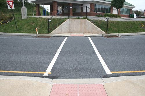
James Howard Kunstler’s eyesore of the month for November.
With a design like this, there probably aren’t very many people about on foot. I doubt the designers responsible for this, er, eyesore set out to deliberately put up barriers to pedestrians. So how did this situation happen?
In all likelihood it came from adhering to the letter (but not the spirit) of rules about design. When this intersection was rebuilt for the Target, crosswalks and pedestrian signals were included. That was likely done due to a statutory requirement.
The Americans with Disabilities Act requires that new crosswalks have wheelchair ramps to allow mobility challenged pedestrians to mount the curb. Unfortunately, in this case, grading for the adjacent building pushed a slope right up to the curb. Installing the curb ramp meant making the slope steeper, and the engineer would have referred to a design manual that called for a retaining wall.
The retaining wall was designed only to cover the minimum required area. In this case, that means just the wheelchair ramp. And the result is a wheelchair ramp that is a complete waste of resources, because it’s entirely unusable not only by handicapped pedestrians, but by able-bodied ones as well.
And of course, even on the other 3 sides of the intersection, none of the crosswalks are linked to sidewalks. If they’re ever installed, this intersection will be ready for pedestrians, with walk signals and painted lines. And it would have been great for the developers of this shopping center to have installed sidewalks along the frontage.
Though that’s probably not a realistic approach in many areas. Lots of suburban and exurban areas are so spread out, that even gold-standard pedestrian accommodations would see little use. But this shopping center is actually in a relatively urban area. The neighborhood to the east is dense, and most of the streets have sidewalks, though they don’t link to the sidewalk-free arterial.
Of course, while I’ve outlined what were likely some of the contributing factors to this atrocity, the root cause is a design system which only includes non-automotive users as an afterthought.
Charles Marohn of Strong Towns does a great job of explaining this idea in the context of Springfield, Missouri’s famed (at least in engineering circles) “diverging diamond” interchange.
The video was shot by an engineer showing how great the diverging diamond is for pedestrians and cyclists. Marohn narrates over this, explaining that, actually, it’s a pretty poor design if the goal is to provide a pedestrian- and cycle-friendly space.
In reality, this interchange was designed to move the most cars as quickly as possible. Cars are the first, second, and third priorities here, according to Marohn. Accommodations for those using alternative modes are just ways to check off the list to make the project a “complete street.”
In many cases, we’ve taken the completely wrong approach to planning and designing our public spaces. It’s nice that Missouri’s DOT put a place for pedestrians to walk on this bridge. But the whole built environment out there has so marginalized the mode of walking, that few will ever feel particularly welcome walking there.
Designing true pedestrian- and cyclist-friendly spaces means starting the design with them in mind. But in many engineering textbooks, people who don’t come in cars are just afterthoughts. And the result is not particularly pretty.