Contest: Design a better Metro map
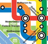
The iconic map.
Do you think you can design a better Metro map? We’re having a contest to see what a new Metro map could look like.
The traditional map has kept its basic form since 1976. Now, there are several reasons for a change. The Silver Line to Tysons Corner will open in 2014. But before that, the “Yellow and Orange Line service increase” will also force a map revision for 2012.
WMATA has retained the original map designer, Lance Wyman, to redesign the map. It’s unclear how close he’ll keep the new map to the original. But you don’t have to replicate the original. In fact, we encourage you to be as creative as you wish in designing a map.
Based on what the WMATA Board has requested, there are some design constraints. The basic line colors should stay the same, but you should feel free to be flexible when denoting alternate services, if you choose.
Maps should also include the first and second phases of the Silver Line as a future line. Phase I is under construction. Phase II is in planning. Feel free to show those as you wish.
The following services will be operating. It is your choice how to show each:
- Shady Grove ⇔ Glenmont
- Grosvenor ⇔ Silver Spring
- Shady Grove ⇔ Silver Spring (off-peak only)
- Vienna ⇔ New Carrollton
- West Falls Church ⇔ Largo Town Center (peak only)
- Franconia-Springfield ⇔ Largo Town Center
- Huntington ⇔ Mount Vernon Square
- Huntington ⇔ Fort Totten (off-peak only)
- Franconia-Springfield ⇔ Greenbelt (peak only)
- Branch Avenue ⇔ Greenbelt
- Route 772 or Reston-Wiehle Avenue ⇔ Stadium-Armory (future)
Some stations will change names, but for this contest, use the current names. For the new Silver Line stations, use the proposed names.
While Metro hasn’t definitively committed to calling the line to Tysons and Dulles the “Silver Line,” it’s very likely they will, so your map should as well.
Metro plans an out-of-system transfer between Farragut North and Farragut West to start this fall. Please depict this on your map too.
The current printed Metro map has a variety of other information and symbols. You are free to include or not include these items, or add others, as you feel appropriate:
- Names of the lines
- Endpoints of the lines
- Connections to MARC, VRE, and Amtrak
- Connections to buses to the airports
- Which stations have parking
- County, city and state boundaries
- Major rivers and parks
- Major monuments
- National Airport
- The Capital Beltway
Maps should be submitted as JPEG, PNG, or PDF files. If you submit a raster image, please use a resolution of at least 7800 pixels in the shortest direction and 8700 in the longest, which will allow printing it at the size of the current maps hung in the railcars.
Send your submissions to info@ggwash.org by April 30, 2011. We will post all qualifying maps in early May. A jury (in formation) will pick their favorite map, and readers will vote on a reader’s choice as well.
Good luck!