Get a cheesesteak in the future
Geoff and Jaime recently tried out a new Philly cheesesteak shop near 14th and U. They noticed something very odd about the Metro map on the back of the menu:
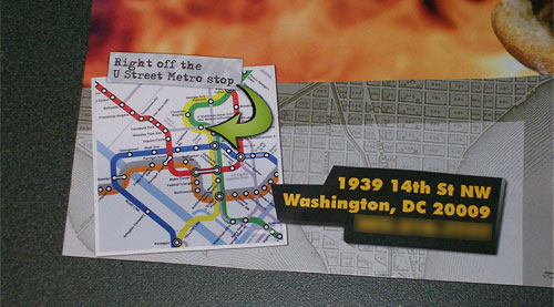
Yup, it’s part of the Metro 2030 map showing a potential future separated Blue Line. Unfortunately, that line doesn’t exist right now, nor do the streetcars that appear there, even if those are closer to reality. This restaurant is now showing all of its patrons how to get there using a public transportation system that doesn’t exist (but ought to).
It’s also the same map that MediaBistro also unintentionally used last year. Any ideas how people could be unintentionally ending up with this map? Different version of the 2030 map do show up as part of a Google image search for wmata map, for example, but so do many maps that accurately reflect current service.