Formal geometry forces awkward South Capitol design
Commenters had almost universally negative reactions to DDOT’s South Capitol Street project, which would build a new Frederick Douglass Bridge with a circle and “racetrack” on each end. The project team responded to some questions I sent along. While they have understandable reasons for choosing what they have, it doesn’t persuade me this is a good idea worthy of the high price tag.
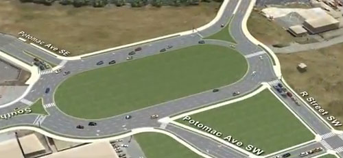
Images from DDOT on YouTube.
The “racetrack” and circle do not come from a traffic engineer’s desire to speed up traffic, DDOT spokesman John Lisle noted. To the contrary, they make it more difficult to move all of the cars through the area. That’s why the circles have to be so wide.
Instead, the designs come from studies 10 years ago that predated the current EIS. The Purpose and Need for the EIS, which defines the objectives of the project and guides the designers as they consider tradeoffs, says:
The Gateway Study (DDOT 2003) proposed that South Capitol Street become a gracious urban boulevard consistent with the past goals defined in the L’Enfant and Macmillan Commission plans, which would accommodate bicycles, pedestrians, and transit vehicles, as well as automobiles and commerce.
Project officials disputed my contention that the 5-year-old EIS is out of date with DC’s needs. They said that, in fact, the EIS was only finally approved in March 2011, and the team has been continuing to refine the design. So criticizing the EIS as 5 years old was the wrong way to make the point; in fact, this design is arising from a 10-year-old set of decisions that put formal design at the top of the priority list.
A number of DC boulevards end in circles. Massachusetts and Connecticut Avenues pass through circles as they leave the District, for instance. Creating some circles on South Capitol is indeed a more L’Enfant-esque design.
However, Westmoreland Circle and Chevy Chase Circle aren’t as wide as these will be, and they don’t really create usable neighborhood public spaces. Nobody uses the interiors, and they’re in much more suburban neighborhoods than this. Circles like Dupont and Logan, which serve more as public space, are far smaller.
The “racetrack” looks like an ugly compromise between a motivation to create a Washingtonian boulevard look and the practical needs to move a lot of cars. L’Enfant designed circles in an era with far less traffic. This project is merging the geometric form of L’Enfant’s circles with the traffic demands of today and ending up with a “camel is a horse designed by a committee” design, with some of the worst of both elements.
We end up with places that don’t move cars particularly well, and a place that’s not especially pleasant to walk or bike around. It would make a great spot for some memorials, though. As the terminus of a L’Enfant street, the National Capital Planning Commission is going to want to site some commemorative works there.
Maybe a really great memorial design could successfully create some kind of public space. Perhaps this is the perfect spot for the Eisenhower Memorial and its large metal tapestries. Here, you’ll need to block out the surroundings, and for a President with road-building as one of his most notable achievements, being in what feels like a sort of highway median could be perfect.
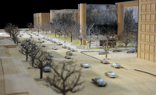
Eisenhower Memorial design. Image from the Eisenhower Memorial Commission.
These places won’t feel pleasant on foot or by bike
The same applies to the I-295 interchange. The draft EIS called for a diamond, which is a far more walkable design. According to the project team,
Traffic analysis of the diamond interchange indicated queuing of traffic on the ramp from SB I-295 to SB Suitland Parkway may back up onto the mainline of I-295, creating a safety concerns. The Final EIS preferred alternative resolved this concern by addition of a loop ramp for this movement.
In addition, the original diamond had all 4 ramps meeting Suitland Parkway at nearly right-angle intersections. The new interchange has several “slip ramps” and angles more of the ramps to facilitate driving at higher speeds between Suitland and 295. That might be sensible for the traffic here, but won’t make for any kind of place that feels safe to walk through.
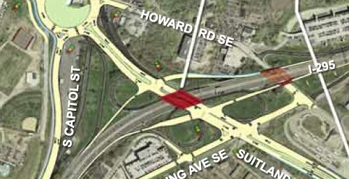
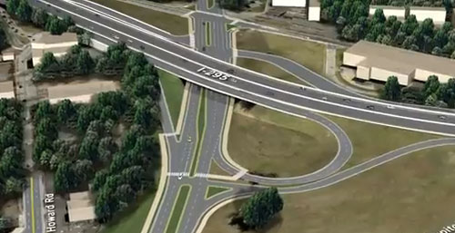
Top: Image from the 2008 EIS. Bottom: Image from the new video.
As preliminary design has progressed, we are also making sure that there are continuous connections for bicycle and pedestrian travel. The new Frederick Douglass Memorial Bridge will have shared use paths on both sides of the bridge that connect to bicycle and pedestrian facilities on either side of the Anacostia. We have also extended the joint use path on the east side of Suitland Parkway from Pomeroy Road SE to Firth Sterling Ave SE.That’s great, but it reminds me a little bit of the people who are so excited about how “diverging diamond” interchanges are safe for pedestrians, or how many Montgomery County upcounty mega-road projects include sidepaths and the DOT calls them “multimodal.” It’s nice to design your large-scale transportation infrastructure element to have a bike and pedestrian path, but any very large, open space with lots of 5-lane one-way segments and high-speed slip lanes is going to feel oppressive to people outside cars. We know how to build spaces that feel comfortable outside a metal box: a grid of streets with buildings containing ground-floor detailing. In fairness, the collection of ramps on the east side of the river is not really pleasant for anyone today, and if the bridge has to move anyway, they’ll have to put in some new design on the Poplar Point end, but this is feels like more of an improvement from the aerial view than on the ground. There are