Map contest winners, part 3: Double bubbles and subtitles
Our jury liked Map G’s continuing the “bold lines” of the current map, but three thick lines just won’t work with the current small circle symbols for stations. What choices are there?
One option was devised by Matt Johnson, author of Map L and the 3rd place finisher in our jury’s voting. He showed stations with multiple circles, one on each of the lines.
Matt’s map also showed off an innovation which could solve the “station naming sprawl”: putting extra pieces of the station’s name in subtitles. WMATA’s Barbara Richardson liked the idea and it’s now likely to become a part of the future Metro map.
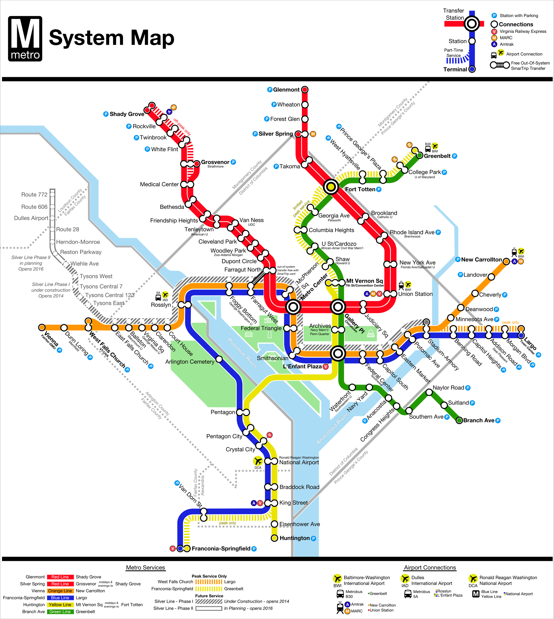
Map L, by Matt Johnson. Click for full version.
Matt and I both entered the contest, but kept our participation secret so that even the jury and readers wouldn’t try to figure out which maps we made and be swayed in any way. As it turns out, we both independently hit on the idea of using subtitles for long station names.
Subtitles deal with the fact that the WMATA Board has voted to include many extra elements on some station names. Keeping them creates unwieldy names, while removing them could stir up political controversy. What about simply making them small on the map? After all, people already call the longer station names by subsets of their titles, like “U Street” and “Vienna.”
The jury liked this idea a lot. Barbara Richardson, head of customer service, communications and marketing for WMATA and a member of the jury, said at today’s WMATA Board meeting that the agency is hoping to incorporate the subtitle idea into the real future Metro map.
The jurors also said they liked the way this map shows the Farragut out-of-system transfer, similar to the way the New York subway map once showed such transfers. As for the multiple circles, Matt got that idea from Amsterdam, and later learned that Salt Lake City uses a similar setup as well.
Other changes weren’t such hits. The jury wasn’t as enthralled about doubling up the Red Line to show the short turns. Since no other lines share the Red Line’s tracks but it runs two sets of overlapping services, the Red Line is in an operational sense two lines, but riders don’t really need to be shown this. Jurors were also split on whether it’s an improvement to replace Amtrak, MARC and VRE logos with A, M, and V circles.