These new maps show where people like to run and bike around the region
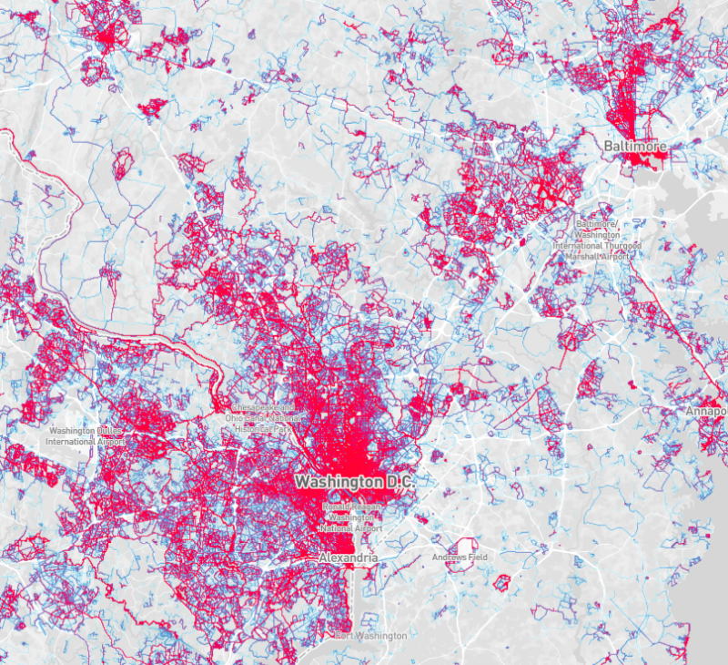
The red on Strava's updated global heatmap shows where people run in the Washington region. Image by Strava.
The fitness app Strava has updated its global heatmap for running and cycling, and it provides some interesting insight into where, and on what facilities, people exercise in the Washington region. However, the map also highlights the region's socioeconomic and racial divide, as its data skews towards higher-income white and recreational users.
Strava's smartphone app uses GPS to track users’ cycling and running routes. The latest global heatmap includes at least six times more data than the previous version, including the map that GGWash editorial director Dan Malouff wrote about about in 2014. While the trends are the same, the latest data shows them on a more granular level.
Runners like trails, but some great ones seem underused
As an avid runner and frequent bike commuter, I use Strava frequently myself and I love their heatmaps. I use my own to judge where I run the most and to make sure I change it up a bit to see more of the area around DC.
The author's personal running heatmap on Strava. Image by Strava.
The app's global heatmap shows that many of the running routes I would expect to be popular indeed are, like the National Mall, the C&O Canal and Rock Creek Park. However, some routes that I think are great, like the National Arboretum and Anacostia Riverwalk Trail, are much less heavily trafficked than I would expect.
The Strava running heatmap of the District and surrounding areas. Image by Strava.
The most popular running areas according to Strava's data share several obvious attributes. DC-area runners like trails with few road crossings, like the C&O Canal and Rock Creek Park, or iconic runs, like the Mall, that are generally easy to get to without a car.
However, the map also shows the socioeconomic and racial split of the District. Runners, especially those who run with smartphones or GPS watches (and are interested enough in their performance to regularly track themselves,) are by and large upper income whites, the majority of whome are concentrated west of the Anacostia River. This describes in part the dramatic lack of tracked routes in Wards 7 and 8.
Fewer runners use Strava track runs east of the Anacostia River. Image by Strava.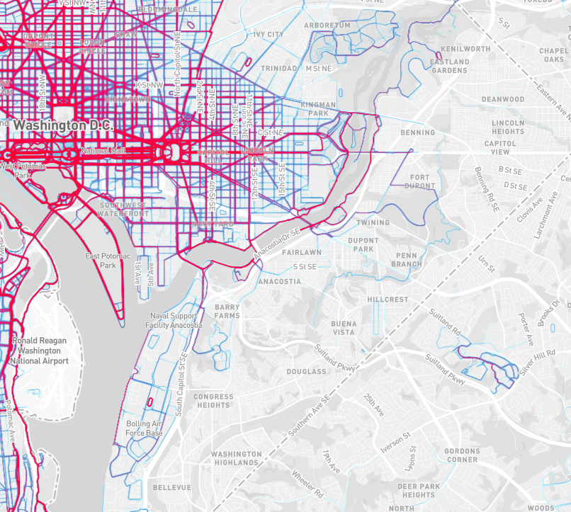
Hopefully more people are out enjoying some of the great running trails east of the Anacostia than the data suggests, like the gem that is the Fort Circle Hiker-Biker trail.
The Fort Circle Hiker-Biker trail in Southeast DC. Image by the author.
The cycling data shows similar trends
Strava's cycling heatmap shows many of the same trends as the running map. Cyclists who use the app tend to prefer separated trails, like the W&OD and Mount Vernon in Northern Virginia, with the data heavily skewed west of the Anacostia River.
The Strava cycling heatmap for Washington DC. Image by Strava.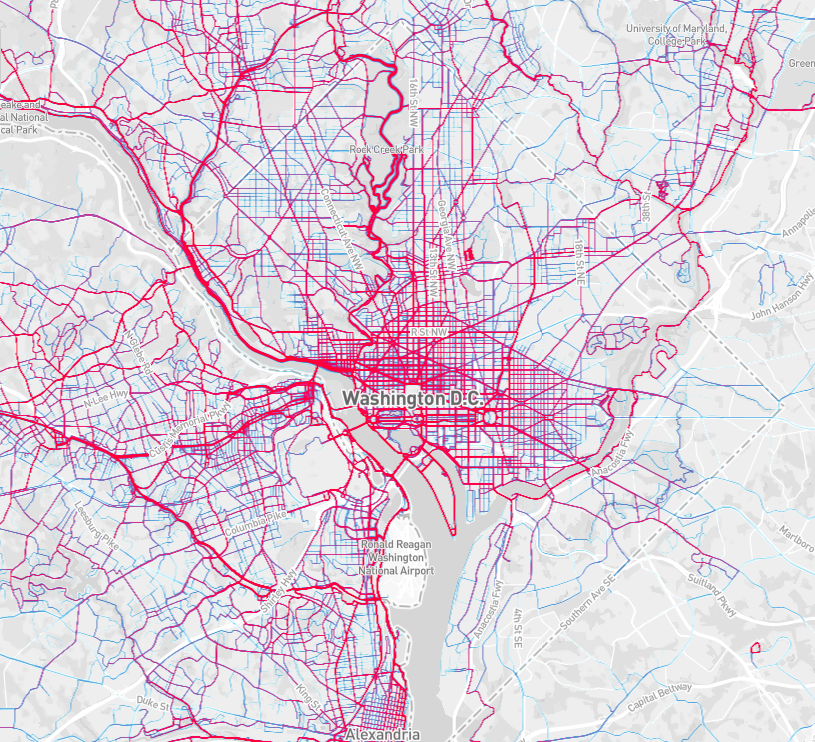
Another thing the map shows is an “If you build it, they will come” phenomenon with urban bike lanes. Streets with bike facilities, like the bike lane on R Street NW, show a higher level of use than parallel streets without marked lanes, like S Street NW.
The bike lane on R Street NW is more popular with cyclists than parallel T Street, which does not have a bike lane. Image by Strava.
Planners should take this data into account when building and improving bike facilities, like considering a protected bikeway on R Street. They should also infer that S Street might see significantly more cyclists if it had dedicated facilities.
Still, as Malouff pointed out in his 2014 post, there is no substitute for hard data when it comes to investing in urban bike lanes.