“Ride DC” puts real-time transit info on the screen
There’s a new tool to show real-time information about Metro, Circulator, Capital Bikeshare, car sharing and more: Ride DC, which launched yesterday afternoon.
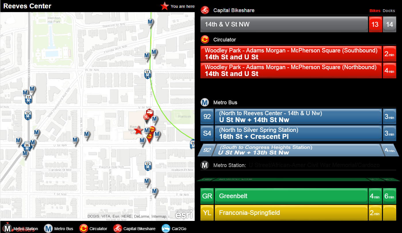
A screen around the Reeves Center at 14th and U, NW.
The design focuses on businesses that might want to put up a large screen in a store, building lobby, or other location. You pick an address and a set of transportation services, and it creates a web page at a specific address where you could point a browser displaying on a large screen.
To set one up, you go to ridedc.ddot.dc.gov, register for an account, then set up a screen. It assumes you’re a business, but you should be able to just make up a business name if you want to try it out.
Right now, it doesn’t work on mobile devices or (some report) iPads, but the @DDOTDC Twitter account said that an app version is coming in January.
Screens build visually upon earlier efforts
These screens share a lot in common with the screen project Eric Fidler built as part of a fellowship with Arlington County in early 2012. (Disclosure: I helped project manage that effort.)
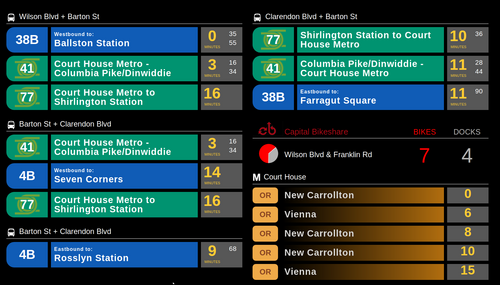
The first screen at Java Shack in Arlington.
Designer Kerry Mitchell created the first designs, and you can see many of the same elements in this screen, like the concept of showing the full Capital Bikeshare docks in red and empty ones in gray, an element I don’t remember seeing on any earlier screen.
Most previous efforts were much busier visually, and the team working with Fidler and Mitchell, which also included Matt Caywood and Kevin Webb, wanted to cut away the clutter and make a design which focused on the key information about routes and times, so that you could see what you need to know at a glance even if the screen were farther away. This new screen, fortunately, maintains much of that simplicity while also adding a map.
Make the screens open source
It’s not illegal or unethical or even rude for this DDOT screen to emulate many of the designs: the project was open source, with the explicit goal of providing a foundation for others to build upon. Caywood built on it most directly by creating his own company, TransitScreen, to offer screens for locations around the nation; it’s headquartered in DC’s 1776 incubator and offers more customization options than the Ride DC screens (but no maps).
The best way for DDOT to also give back is to make its own code open source. Taxpayers paid for the work, after all, and there’s no reason to need DDOT to keep a lot of control. DDOT is not going to have the resources to add every feature anyone could want.
Therefore, it should keep running and improving its own service to give many people a quick, turn-key way to create a screen, and at the same time, open up its code so that others could build upon it in other ways.
Even better would be if DDOT had built upon the open source code already in existence. It might have saved money, and could have made it easier for people in other cities to benefit from what DDOT has done. That’s what Caywood did when he organized a hack day to get civic hackers building their own screens and adding to the code base that everyone could use.
The best way to create valuable, reusable public technology is to foster a robust open source project where multiple individuals and organizations contribute. Nobody has to pay to reinvent the wheel, and everyone’s efforts benefit others.
How the screens can be better
After all, there are plenty of little ways to continue improving this screen, as there is with the first version of any piece of software. You can’t scroll or zoom the map right now; that would be useful.
When the data updates, the lines “flip” like an old-style train arrival board, which is cool, but they flip a lot; it looks like about every five seconds. That’s distracting. It may make more sense to only “flip” when a number actually changes, or at least flip everything less frequently (an exception is when there are more bus lines than there’s room, in which case it should flip more).
The screen creator selects whether to include services within a two, four, or six-minute walk, but often someone will want to include services that are farther away, especially something like a Metro station. It would make sense to offer larger distances, or decouple the distance for something like buses with Metro; you very well may want to only show buses six minutes away but also include a Metro station ten minutes away.
You can’t show two Metro stations at once; instead, if there are two, it toggles. This is the same as what it does for buses, scrolling between all of the different lines. However, you could certainly imagine the screen owner wanting to show multiple Metro stations at once, especially if they aren’t showing as many bus services at the same time.
This broad question, about how to pick among data, is one of the most complex questions we dealt with in the 2012 project. This project chose one reasonable option: basically, for each service you select, it blocks off some space and then rotates between everything inside your zone. That’s a simple way to do things that will work for most people. The 2012 project and TransitScreen instead offer more customization, where you can pick which and how many bus lines, Metro stations, etc. to include.
It’ll be worth watching this DDOT project closely to see what else the team adds.