More map contest results, part 5: Rounding out the set
Our map contest has 3 final entries to discuss. And one contestant entered 3 additional maps which were not part of the judging.
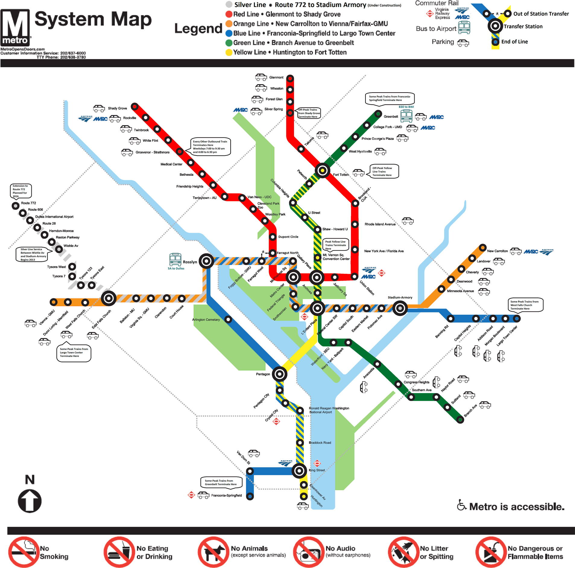
The first entry is Map P, by Ioan Ifrim. This map’s distinctive feature is use of “candy-striping” for sections of the system where multiple lines run together.
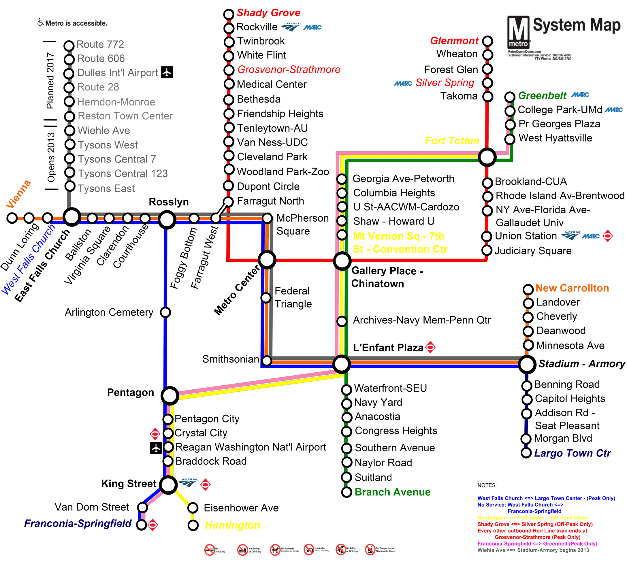
Next up is Map A, by Roger Wilson. This map keeps the system simple. Roger intended to create a map readable at a distance.
The main driver behind my design was readability. With the current map, you have to get quite close to read the station names. Given that the maps are near the doors on Metro, the smaller the font, the more likely the map would encourage crowding near the already-crowded doors.
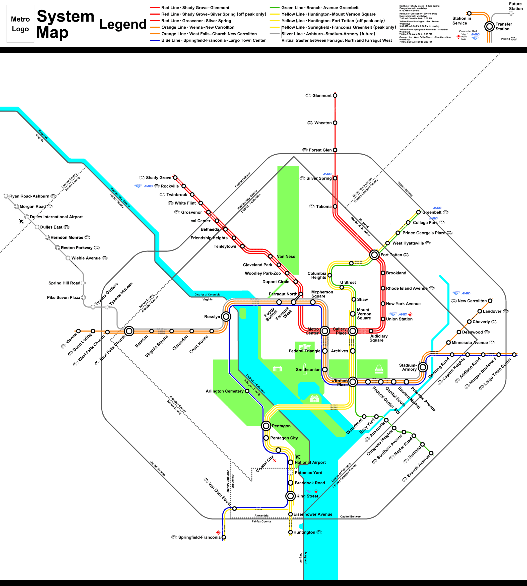
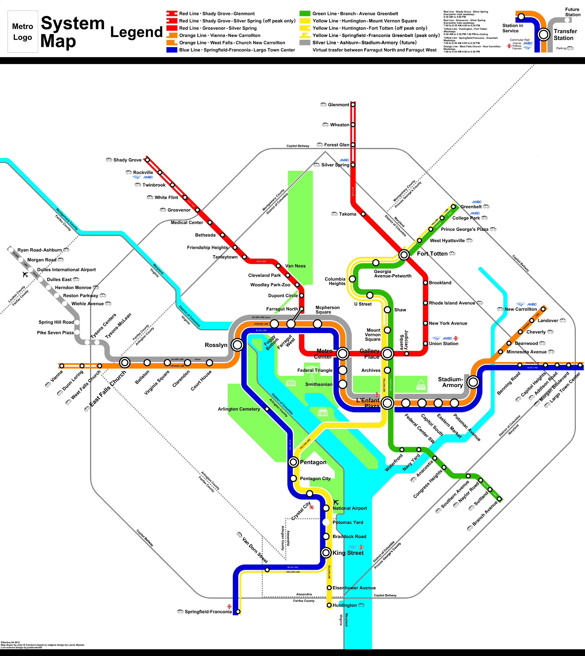
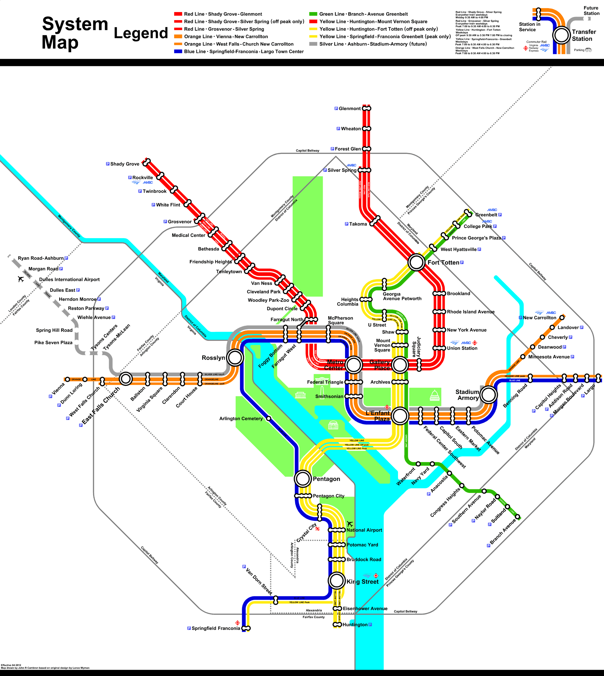
Our final entrant, John Cambron, submitted 4 maps. We limited participation in the contest to one map per person. But John wanted to show a multitude of techniques possible for the Metro map, and we agreed to post his extra maps at the conclusion of the contest.
His contest entry includes a line for each service. The line weights are the same regardless of the period of the service, but text is included on each line to indicate when the service operates.
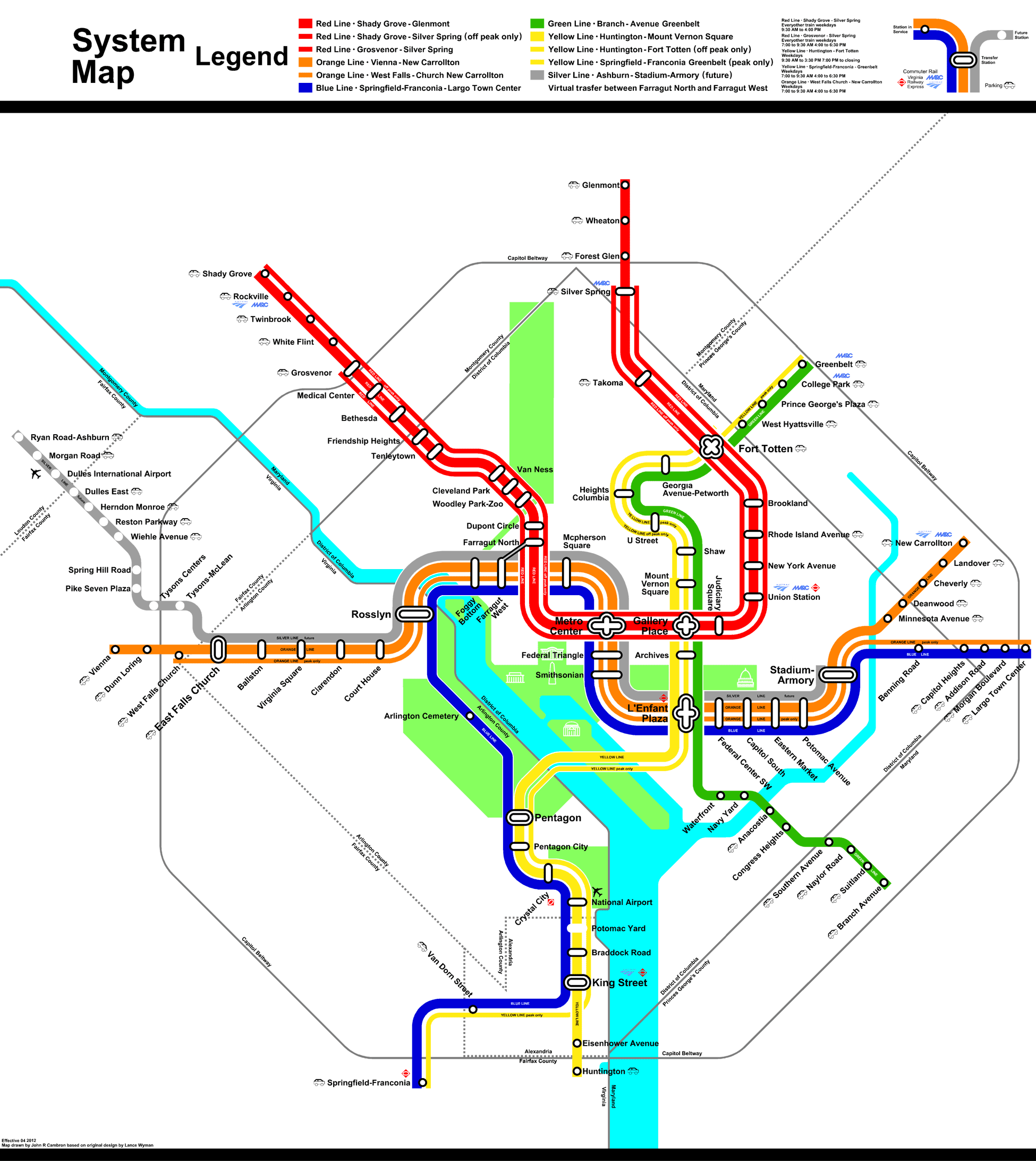
Here are John’s “bonus” maps.