New strip maps make navigating Metro harder, not easier
With the Silver Line close to opening, Metro has replaced signs throughout the system. But new strip maps in stations are a step backwards. They confuse many riders with labels that line up in a misleading way, and try to cram too much information on the maps.
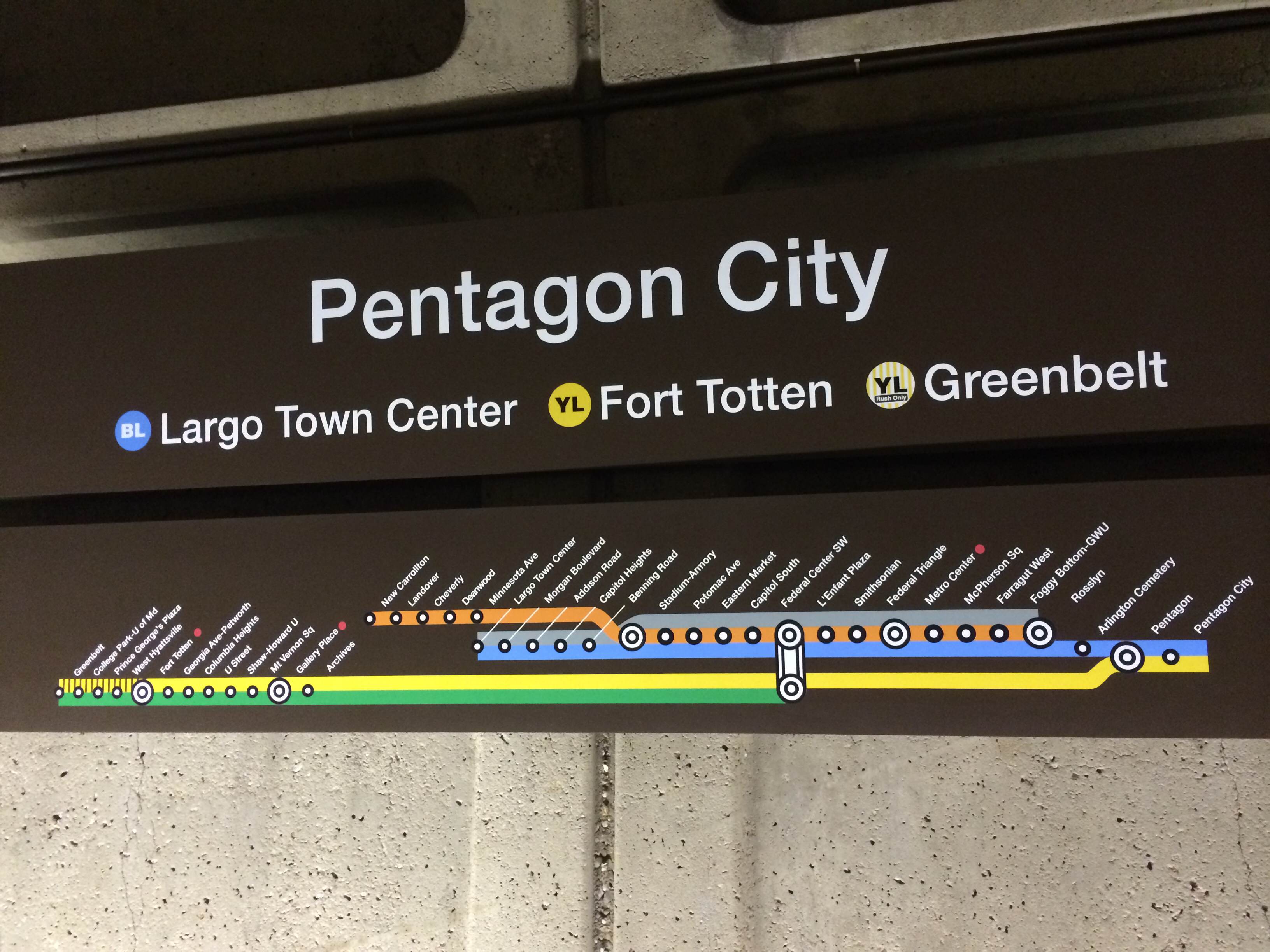
Reader Daniel Peake sent in this image from Pentagon City:
Another rider also sent it to the Washington Post’s Dr. Gridlock, who wrote about it Monday.
The labels are confusing
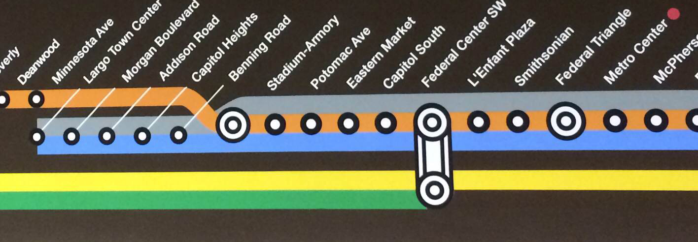
Because the map has three thick lines together, the labels are far from the station dots. As a result, they’re closer to the adjacent dot. It looks like the transfer station between the Green and Yellow lines and the Blue, Orange, and Silver lines is Federal Center SW.
On the left, where the Orange Line is between the Blue/Silver station dots and the labels, the map uses a line called a leader line. But that’s not the case for the stations with three lines.
The map lines up the (vertical) centerline of the label with the 45° axis of the dot. Because the vertical distance from the dot is greater than the distance between the dots, the label appears closer to the adjacent dot.
One solution would be to move the labels so the corner of the text (or technically, the text’s “Core Type Area”) lines up with the dot instead. Map designer Cameron Booth has a great description of how to do this.
The map is too complicated
The label alignment isn’t the only problem with this map.
Two rail lines serve Pentagon City: the Blue and Yellow lines. The purpose of a strip map is to show all the places you can go with a one-seat ride from the platform you’re on. Though WMATA no longer has these aboard trains, generally on-board strip maps show all the stops in both directions on that line (unless they are on digital displays which can change).
But the strip maps here show the Blue, Yellow, Green, Orange, and Silver lines. The Green, Orange, and Silver lines don’t call at Pentagon City, so there’s no need to show them on the maps with anything other than a colored dot at the first and last transfer points (as the map does for the Red Line).
There’s really no reason to show riders that the Orange and Blue run together from Rosslyn to Stadium/Armory on a strip map. Getting to New Carrollton requires a transfer to the Orange, just like getting to Vienna does. But the strip map only shows New Carrollton, not Vienna. Why? To a user, it shouldn’t matter that the transfer happens in the “same” direction.
Conversely, what’s the point of even showing the concurrent Silver Line? A Blue Line rider at Pentagon City going to Largo doesn’t need to know about the eastbound Silver Line. He or she can just stay on the Blue train. There’s no point in getting off at, say, Eastern Market and waiting for a Silver Line train going to the same place.
In the future, WMATA strip maps in stations will be easier to understand if they only show downstream stations on lines that call at the station you’re at. At Pentagon City, that would mean only showing Blue and Yellow stations in the appropriate direction.
The new maps are overly-complicated and poorly-labeled. They don’t do riders many favors.