Redistricting Game results, part 2: Where people want to live
How can we derive useful information from 3,981 maps that could help the DC Council make choices?
We could simply give everyone a vote and see which areas get changed in the most maps, but that wouldn’t be very fair. Many people just switched areas that looked best on a map. Some folks definitely do know the area, though: people who live in that particular area.
What did people say about the places they live personally? Who would like to see their home part of a different ward?
The “game” started by asking people where they live. If they clicked an area in DC and that area is on the border between wards, it then asked them which ward they’d like to live in. We can see how many people liked the ward they’re in:
| Ward | Border respondents | Chose own ward |
|---|---|---|
| 1 | 735 | 80.7% |
| 2 | 525 | 72.6% |
| 3 | 271 | 83.0% |
| 4 | 205 | 55.1% |
| 5 | 272 | 33.1% |
| 6 | 555 | 87.4% |
| 7 | 81 | 46.9% |
| 8 | 45 | 55.6% |
The only people who got this question are people who live in one of the areas bordering the other ward. Therefore, this doesn’t mean that 80.7% of Ward 1 residents want to be in Ward 1, but 80.7% of the people who live at the edge.
We can tell from this that the wards most popular with their own border residents are 6 (Tommy Wells), 3 (Mary Cheh), and 1 (Jim Graham), while the least popular ward is 5 (Harry Thomas, Jr.) People’s choice likely revolves around a few factors. There’s which councilmember people want representing them, for sure. There’s also which area people feel most geographic affinity to.
The RPP zones also factor in. It’s a silly policy, but a resident’s resident parking permit is tied to the specific ward in which they live. People can park for free as residents even in another part of their own ward, but not in another ward. That means that when part of Chevy Chase got moved from Ward 3 to Ward 4, not only did the councilmember change, but people then stopped being able to drive to Woodley Park Metro and park in the neighborhoods but could now do so at Petworth.
When the Palisades got moved from 2 to 3, some people were more upset about losing the ability to park as residents in Georgetown or around Mount Vernon Square than about ceasing to be represented by Jack Evans. DC could easily remove this incentive by creating parking zones based on geographic features and distinct neighborhoods instead of ward boundaries, but that’s not how it works today.
Among people who wanted to switch wards, what other wards did they prefer?
| Wants to be in | |||||||||
|---|---|---|---|---|---|---|---|---|---|
| 1 | 2 | 3 | 4 | 5 | 6 | 7 | 8 | ||
| Lives in | 1 | 80.7% | 14.4% | 1.9% | 2.4% | 0.5% | |||
| 2 | 18.1% | 72.6% | 5.0% | 1.3% | 3.0% | 0.0% | |||
| 3 | 5.5% | 9.2% | 83.0% | 2.2% | |||||
| 4 | 20.0% | 22.4% | 55.1% | 2.4% | |||||
| 5 | 32.4% | 14.7% | 1.8% | 33.1% | 17.3% | 0.7% | |||
| 6 | 10.5% | 0.7% | 87.4% | 0.2% | 1.3% | ||||
| 7 | 1.2% | 45.7% | 46.9% | 6.2% | |||||
| 8 | 4.4% | 13.3% | 26.7% | 55.6% | |||||
It’s important to note that not everyone got all of the options. People only got to pick wards that were adjacent to their area. For example, a lot more people in Ward 5 said they want to be in Ward 1 than said they want Ward 2, but there are many fewer people in the Truxton Circle area that get Ward 2 as a choice, versus many more people from Bloomingdale to the Armed Forces Retirement Home eligible for the choice between 5 and 1.
The most informative way to look at that part of the table is to compare two squares for the same pair of wards, on opposite sides of the diagonal. For example, only 0.2% of Ward 6 border residents wanted to be in Ward 7, but 45.7% of Ward 7 border residents wanted to be in Ward 6 (and not all had the choice!) This particular result is probably mostly Kingman Park, the part of Ward 7 west of the river, whose residents generally want to be in Ward 6 instead of 7.
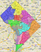
Digging down further, what about individual areas? This map shows each area in the “game” and which ward the residents of that area picked.

Click for larger and interactive version.
The darker the color, the stronger the sentiment in that area for a particular ward. If a plurality chose a different ward than what it is today, that area has a darker border. The areas with no or almost no residents are grayed out.
89% of the 38 people in Kingman Park wanted to switch back to Ward 6. 42% of the 72 respondents in Truxton Circle, now in Ward 5, wanted to go to Ward 2, and 28% wanted Ward 6; Ward 5 came in only third among the residents’ preferences. The 2 people in the little triangle east of North Capitol between New York and Florida Avenues both would switch to Ward 6, though ironically, Ward 5 beat out 2 and 6 for the 10 people who live in Ward 6’s “chimney.”
People on the Ward 5 and 1 border, in Bloomingdale and around the Hospital Center, preferred to be in Ward 1, while people on Ward 1’s western outpost, between Connecticut Avenue and the Zoo, would go for Ward 3. The western districts of Ward 4 in Chevy Chase, west of Utah Avenue, would go back to 3 given the choice, but only 23% of the people east of Utah Avenue chose to move.
In other areas, a majority didn’t choose to change, but sentiment was still deeply divided. That includes most of the Ward 2-3 border on both sides, the Penn Quarter segment of Ward 6, most parts of Ward 5 near either 6 or 7 or in Ward 8 near 7.
Surprisingly, only half the 38 respondents in Sheridan-Kalorama would stay in Ward 2, the others preferring 1 or 3, and similarly half of the 30 Crestwood participants would change from 4 to either 1 or 3. Both groups preferred 1 over 3.
The 1 person from Bellevue, in DC’s southern tip, made a map that puts it into Ward 2 along with Bolling.
It would be great if every area could be in the ward more people preferred, but that’s not possible. This map makes wards 2 and 3 far too large, and 1 also is too large. 5, 7, and 8 all become too small, with 7 getting much smaller than today where it actually has to grow.
There is only one shift that residents of an area chose and which also helps advance the ultimate redistricting goal. Census Tract 76.05 contains the southern part of the Fairlawn neighborhood, and is a small piece of Ward 7 that looks like it’s protruding into Ward 8. 6 people from the Ward 7 portion made maps. 3 moved it into Ward 8, while 2 kept it in 7 and 1 moved it into 6.
As it turns out, this change is the one that is the most clear-cut by any metric. We’ll examine this and other possible solutions in an upcoming part.