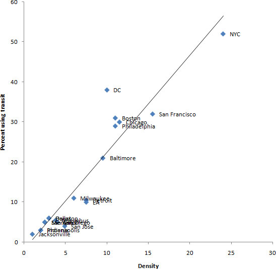
The outlier
From Cities in Full by Steve Belmont (page 25):
Generally, population density and transit ridership go hand in hand. But one city stands out as having a higher-than-usual percentage of commuters taking transit compared to its density.
Update: Commenter Ward 1 Guy created a scatterplot of this data, which I ran through XYChartLabeler to put the city names on each data point (which Excel stupidly doesn’t support). Here’s the chart.