Visualize this: A safe bikeway on Q and R Streets

Drivers misuse R Street's existing bike lane, putting people at risk. Image by Nick Russo used with permission.
When volunteer bike advocates in DC’s Wards 2, 5, and 6 looked at ways to improve conditions for bike and scooter riders, we agreed our efforts should focus on the painted bike lanes on Q and R streets NW and NE, where riding can be stressful even on the best of days.
Riders in our group know the dangers well. Without the protection of flexposts or curb-stops, bicyclists and scooter riders encounter vehicles stopped in the lanes, motorists veering into them, inch-close dangerous passing by heavy vehicles, and the constant threat of being “doored” by someone exiting a parked car.
Some advocates initially unfamiliar with the conditions on Q and R streets could relate to the first-person and photographic accounts, but needed to see something more before signing onto our campaign.
It turns out they needed to see the data.
A wide range of data, one important story
Fortunately, a variety of datasets are available today to help us visualize activity on the District of Columbia’s streets.
Vehicle counters, fitness heat maps, and bikeshare rental data track where, when and how people use our streets. Crash data measures personal injury and property damage wreaked by vehicles. Meanwhile the US Census and associated household surveys–along with descriptive maps produced by DC’s own Department of Transportation (DDOT)–help policymakers understand how residents and visitors to Dupont Circle, Logan Circle, Shaw, Truxton Circle and Eckington might benefit from safer street infrastructure.
Our campaign for an east-west, low-stress bikeway–bike lanes separated from moving vehicles by a physical barrier–relies on three main conclusions, each underpinned by multiple data sources. Whether you bike on those streets or not, the data provides persuasive evidence that:
1. The existing, painted lanes on Q and R streets NW / NE are not safe. Vision Zero data shows crashes on the two streets resulted in injuries to 53 bicyclists, 31 pedestrians and 171 vehicle drivers and passengers over 5 years–nearly 1 injury per week. If “unknown injuries” and property-only crashes are factored in, the Q/R corridor on average sees a crash every other day.
Furthermore, although the MoveDC plan designates Q and R streets (both NW and NE) part of the Bicycle Priority Network, the existing lanes do not meet DDOT’s own minimum safety requirements for streets, like Q and R, which the agency’s Functional Classification Map designates as “minor arterial streets.” MoveDC states: “Any bicycle facilities planned for minor arterial streets will be fully-protected facilities.
2. An east-west bikeway would connect several north-south bikeways. According to DDOT’s bikeway planning map, an improved Q/R bikeway would enable riders to access at least six north-south protected facilities: on 17th, 15th, 9th streets, and New Jersey Avenue in Northwest, plus First Street, Florida Avenue, Lincoln Road and the Metropolitan Branch Trail (MBT) in Northeast.
An east-west bikeway would extract maximum value from the north-south lanes DDOT has already built while enhancing the safer, low-stress bike network in a key connecting corridor.
Image by the author.
3. Neighborhoods along this route are among the densest populated–and least wedded to car ownership–of any in the city. A safe east-west, low-stress bike network has the potential to convince many more people moving within these communities to choose a lower-cost mode of travel without the negative impact on neighborhood safety and air quality caused by single-occupancy cars.
The campaign for an east-west, low-stress bikeway in the Q/R corridor has garnered significant support. This summer three ANCs–2B, 2F and 6E–unanimously passed resolutions urging DDOT to present design solutions for the corridor. The Eckington Civic Association also wrote a letter of support and more than 1,150 people signed a petition asking DDOT to build a “truly low-stress and safe bikeway.”
US Census and ACS data: a bird’s-eye view of neighborhood mobility
Some datasets are capable of providing perspectives on a problem at 30,000 feet, at street level, or somewhere in between. So it helps to begin describing the Q and R corridor with the mother of all datasets: the 2020 US Census and related American Community Survey (ACS).
The ACS, in particular, is rich with detail about neighborhood characteristics, several of which suggest communities in the Q/R corridor could benefit from the construction of an east-west, low-stress facility.
Population density and vehicle ownership
The 2020 Census established DC’s population at 689,545 people. They live in a total land area of 61.1 square miles (as defined by DC Open Data), making the average population density of the District of Columbia 11,286 people per square mile.
By contrast the Q/R corridor–defined as those census tracts within a quarter mile of either Q or R street between Connecticut Avenue NW in Dupont Circle and the MBT in Eckington–constitute just 4.7 square miles with a population of 101,017 people. The corridor’s density of 21,493 people per square mile is nearly twice that of the city as a whole.
Data from American Community Survey. Image by the author.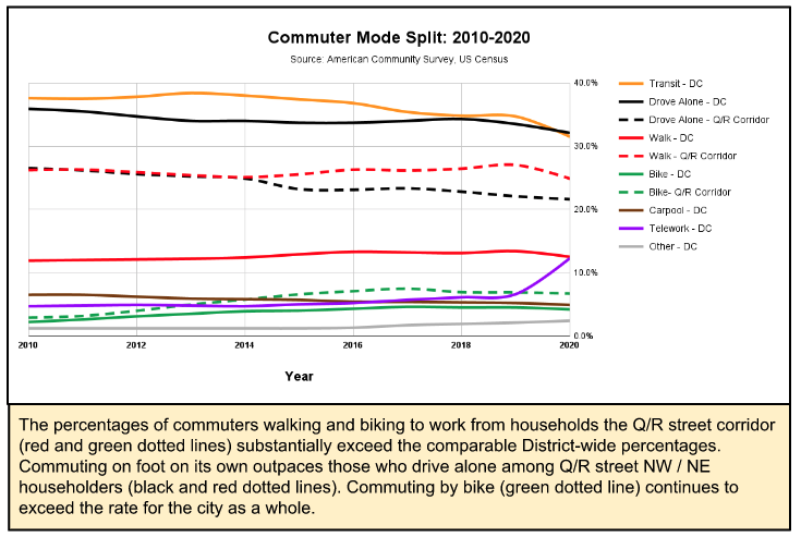
Among the specific household characteristics surveyed during the annual ACS is the number of cars available to the respondent’s household. In every survey conducted from 2010 to 2020, householders reported “no car available” in a significantly higher proportion of households in the Q/R corridor than in the city as a whole. In 2020, 36.69% of households in the corridor reported not having a car versus 25.3% District-wide.
Access to safe bike routes in these dense neighborhoods are the key to the mode shift that underlies a successful Vision Zero strategy.
Patterns of micro-mobility
Commuting modes also surveyed by the ACS illustrate why the Q/R corridor should be among DDOT’s priorities for safer bikeway infrastructure.
Bike commuting within the Q/R corridor was more popular and grew faster than the district as a whole for each year 2010 to 2020. While biking percentages did not differ widely in 2010 (2.2% in DC vs 2.9% in the corridor), by 2020 bike commuting was the norm for 6.7% of households in the Q/R corridor, compared with 4.2% for the District as a whole.
The percentage of those walking to work is also significantly higher within the Q/R corridor than for the city as a whole–more than twice as common each year from 2010 to 2020. The corridor’s residential character and location relative to downtown DC, historically a major employment center, helps explain why biking and walking are prevalent in its neighborhoods.
Data from DC Open Data. Image by the author.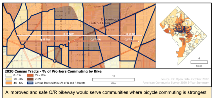
The ACS also queries householders about the length of their commute and, sure enough, for each year 2010-2020 a higher percentage of people in the Q/R corridor than the city as a whole reported they live within 30 minutes of their place of employment. In 2020, 51.59% of residents within the corridor lived within 30 minutes of their place of employment versus a rate of 45.5% citywide.
Shorter commutes that can readily be accomplished on foot or bicycle clearly contribute to the higher rates for these modes in the Q/R corridor. These neighborhood characteristics strongly suggest that, by improving sidewalks and protecting bike lanes, the city could induce many more residents who do not currently walk or bike to adopt these modes.
Aggregated user data provide another perspective on patterns of bicycle and scooter usage in the Q/R corridor.
Fitness app data
The location-enabled fitness app, Strava, provides its subscribers with a zoomable global heatmap of user data representing the favorite routes of runners or bicyclists. The bicyclist data we analyzed skews towards recreational rides, so it covers a slightly different constituency than the ACS commuter surveys.
The Strava heatmap (below) shows activity in central DC from Rock Creek Park at P Street NW to the MBT. The east-west Q/R corridor crosses several popular north-south routes, including the heavily used 15th Street NW bikeway. Glowing lines along Q and R streets show they already are the preferred east-west routes for Strava users.
A screenshot of Strava activity around the Q/R corridors, taken by the author.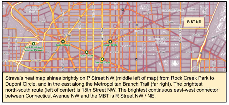
A safer east-west bikeway would not only build out a stronger low-stress network but also tap into latent demand for a connection between two important recreational facilities: Rock Creek Park and the MBT.
Public bikeshare data
One of the richest public datasets available for understanding bicycle usage in the District comes from the Capital Bikeshare system’s accounting of user trips. Published every month, this dataset identifies the starting and stopping points of each ride taken in the system.
Data from DC Open Data. Image by the author.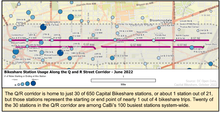
The bikeshare system as a whole has 650 stations in DC, Maryland, and Virginia. The popularity of each station can be ranked by the number of trips that start and stop at each station.
All 30 stations within the Q/R corridor are among the top 300 busiest bikeshare stations. The station at New Hampshire Avenue and T Street NW is the second-busiest for ride starts and fourth-busiest for stops in the entire bikeshare system (the busiest station for ride starts is at the Lincoln Memorial).
The New Hampshire and T St station accounted for 15,605 trips starts and 15,489 trip completions in the first six months of 2022, representing 7.2% of trips in the Q/R corridor and about 2% of all trips systemwide during that period. The New Hampshire and T Street NW station is a quarter-mile from R Street and adjacent to the 17th St bikeway.
Data from DC Open Data. Image by the author.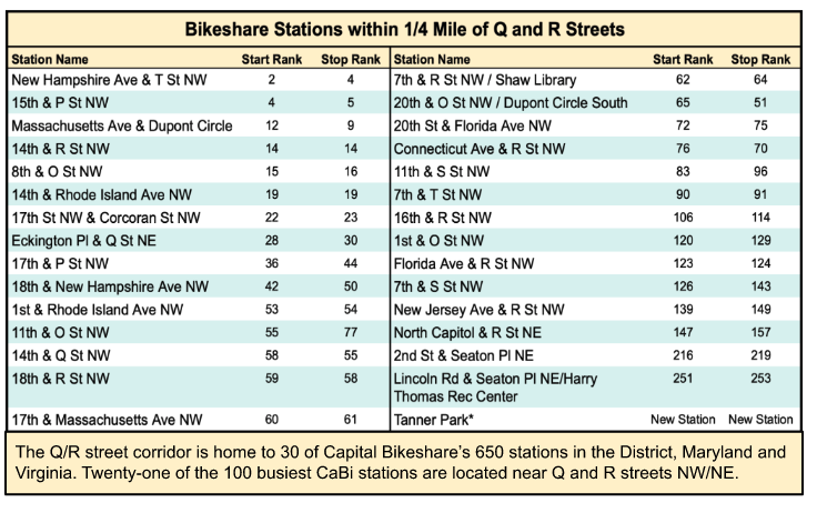
To understand patterns of ridership within the corridor, we examined the first 6 months of 2022 and 2021. From Jan. 1 to June 30, 2022, CaBi customers took 1,551,098 trips within the system, a 41.6% increase over the 1,095,060 trips recorded in the same period of 2021, when the pandemic significantly curtailed in-person meetings, both personal and professional. The Q/R corridor saw 48% year-to-year rebound of bikeshare trips, with 215,397 trips begun and 214,878 trips ended at stations in the corridor.
Looking at daily ridership, the entire CaBi system averaged 8,554 trips each day during the first six months of 2022. Of that number, an average of 1,190 trips started and 1,187 ended in the Q/R corridor each day.
Stated another way, 823 daily trips began in the Q/R corridor and ended elsewhere in the CaBi service area, and 820 trips began somewhere else and ended in the corridor. Another 367 trips started and ended within the Q/R corridor. Remarkably, then,23% of all daily CaBi trips–nearly 1 out of 4–either started, ended, or remained entirely within the corridor.
Data from DC Open Data. Image by the author.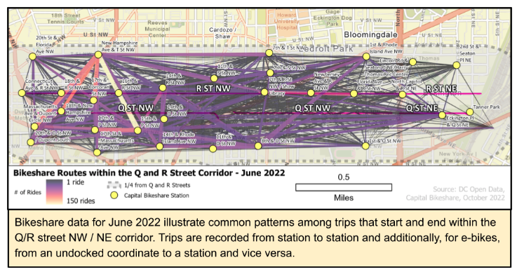
Scooter trip data
Data provided by the companies that make shared scooters and bicycles available on DC streets do not reveal the start and end points for individual trips. But publicly available sources such as Transit API do show when and where scooters are available for rental. We queried the database for 10 days at the beginning of September 2022, downloading the number of scooters available in the corridor every half hour.
Data from DC Open Data. Image by the author.
On average, there were 648 scooters and e-bikes available at any given time, with at least 500 available at any hour of the day. The map illustrates the wide availability of this transportation mode within the corridor, particularly the hotspots on the 14th Street Corridor, at and around 7th and Q Streets, and near Rhode Island Avenue in Bloomingdale.
Crash data
Public safety data points to the need for protected lanes and is a critical component of any study of infrastructure improvements.
Although DC’s Vision Zero project is often criticized for failing to reduce crash injuries or fatalities, the weekly updates of crash data at its heart allows everyone with a computer to see in frightening detail where and when crashes occur and to whom. The database also details the scope of injuries inflicted on people using the public rights-of-way and the numerous crashes that result in property damage.
To better understand traffic crashes in the corridor, we looked at data from DC’s Open Data portal for a 5-year period (October 2017 to September 2022), filtered for crashes reported on or within 50 feet of Q and R streets.
In the Q/R corridor over five years, the Metropolitan Police Department reported a total of 1,062 crashes: 17.7 crashes per month or 0.58 crashes per day. Put another way, there is a reported crash within the corridor every other day.
Data from DC Open Data. Image by the author.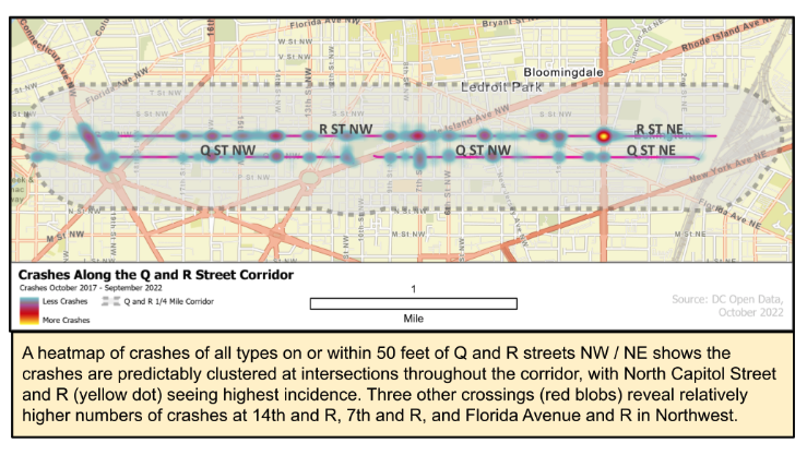
About 45% of these crashes involved at least one injury. While the remainder did not result in a reported injury, the property damage to personal and public property (damaged vehicles, buildings, traffic infrastructure, etc.) compromises quality of life along the corridor.
Data from DC Open Data. Image by the author.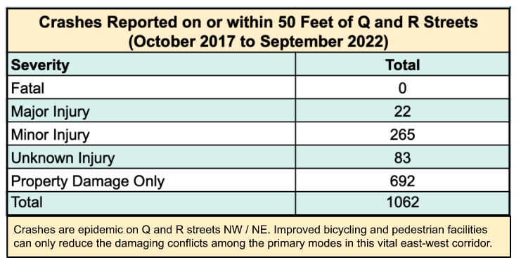
While there were 1,062 crashes, there were 2,341 people reported as being involved in these crashes and 39.7% of them, a total of 930 people (pedestrians, bicyclists, vehicle drivers or passengers) suffered injuries.
Regardless of mode, people are being injured along the corridor at an alarming rate, suggesting that improved infrastructure along the Q/R corridor would make all users safer on these streets.
Any way you slice it, changes are needed on Q and R
Initiatives such as the campaign for a safer bikeway on Q and R Streets have always relied on the personal testimony of those most directly affected by dangerous streets. But crash and near-miss anecdotes are one thing; the continuing pattern of traffic mayhem exposed by Vision Zero crash data is quite another.
Today a growing number of data sources are available to allow the public, DDOT and elected officials to understand and evaluate the worthiness of a campaign such as ours. Among data’s strengths is that, when viewed in context, it can illustrate patterns and problems that personal anecdotes cannot.
The data we’ve analyzed provides compelling evidence to consider as DDOT begins redesigning the unsafe bike lanes along Q and R streets. Those who currently use these routes deserve safe infrastructure that conforms with contemporary standards for bike lanes. If provided with safer routes, more people–of all ages, means, talents and abilities–may find that using a bike or scooter for their journey makes the most sense for them.