Maps show racial divides in Greater Washington
Eric Fischer created amazing maps showing the racial and ethnic distribution of people in various American cities using data from the 2000 Census.
I’ve added jurisdiction boundaries, freeways, and Metrorail lines to put the DC region’s map in context:
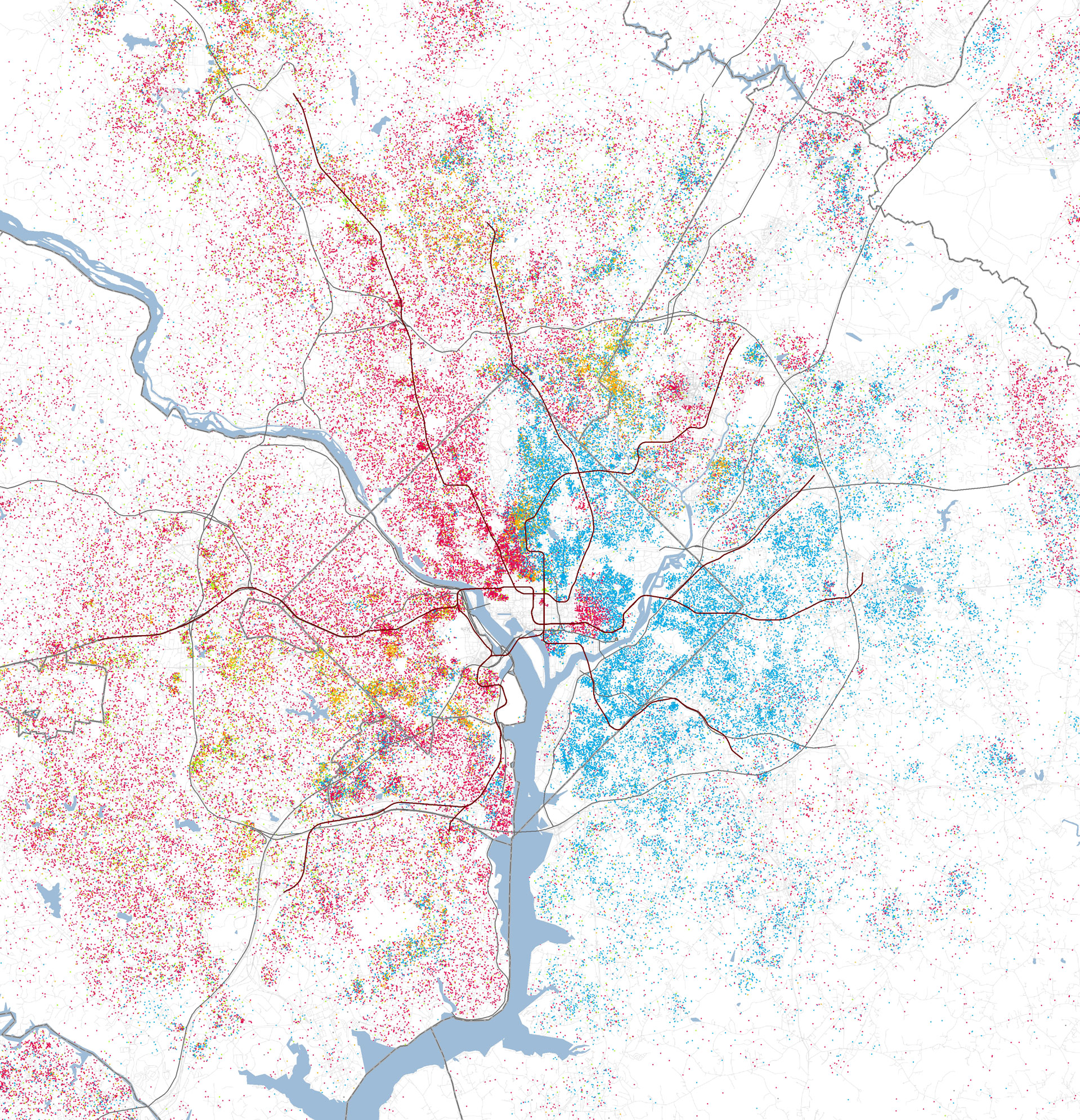
Each dot represents 25 people. Red = white, blue = black, green = Asian, orange = Hispanic. Metrorail lines are in brown, roads in gray.
In DC, the division between white and black neighborhoods seems to be fairly stark. Rock Creek Park appears to be the major feature separating the groups.
One can see an interesting feature near Columbia Heights, where largely-Hispanic Mount Pleasant appears as a bright orange splotch between the groups. Adams Morgan and the Dupont and Logan Circle areas are white areas that are east of Rock Creek Park. And Capitol Hill stands out in an otherwise black part of the city.
It would be very interesting to see these data over time. How have the racial settlement patterns changed over the last decade (since this snapshot was taken)? Did that shift play a role in some of the racial tensions noted in this year’s DC mayoral election?
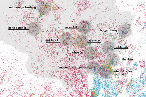
Dan Reed notes how Montgomery County is more integrated than DC or Prince George’s, or even Fairfax:
For almost forty years, Montgomery County has expressed a commitment to racial and economic diversity through its government policies, notably its Moderately Priced Dwelling Unit (MPDU) program, which provides subsidized housing for low-income households. This map provides some insight into how successful those efforts have been.
While the District has a fairly strong distinction between white and black neighborhoods, and most of Prince George’s County appears to be solidly black, Montgomery County looks like a bowl of rainbow sprinkles. Even areas that have a reputation for housing one ethnic group — Hispanics in Wheaton, for instance — show a far finer-grained mix of people. Save for the Takoma-Langley Crossroads, where you can see a big blob of orange dots (for Hispanics), there are few obvious ethnic enclaves on the map.
Montgomery County neighborhoods, like downtown Silver Spring, appear to be far more integrated than those in the District or Prince George’s County. Except for white enclaves, of course. The west half of the map — Bethesda, Rockville and Potomac — doesn’t look at all integrated from first glance. Nonetheless, there’s still some clustering of green dots (for Asians) along Darnestown Road in North Potomac.
Base map by Eric Fisher, overlays by Dan Reed.