This zoomable map shows where America is growing and shrinking, at the neighborhood level
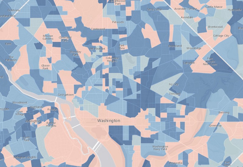
Population growth by census tract for cental DC and Arlington. Image by Esri.
This awesome map from Esri shows the projected population growth rate for US census tracts between 2012 and 2017. On it, you can see where America is growing and shrinking at a very fine level of detail.
On the map, darker blues mean there was more growth. Pale orange means there was no growth or a decline.
Within DC, it won't surprise anyone to see that NoMa and the Ballpark neighborhoods stand out as large, fast-growing areas. Meanwhile, the patchwork pattern of growth in the Mid-City neighborhoods likely shows how one or two new buildings can turn a census tract from orange to blue.
Zooming out to the metropolitan scale, you can see how growth in the closer-in and middle suburban areas is concentrating into clusters, while the far-outer suburban areas are in a boom just about everywhere. You can also clearly see the region's east-west economic divide at work, with the numerous orange tracts in Prince George's County.
Growth in the Washington region. Image by Esri.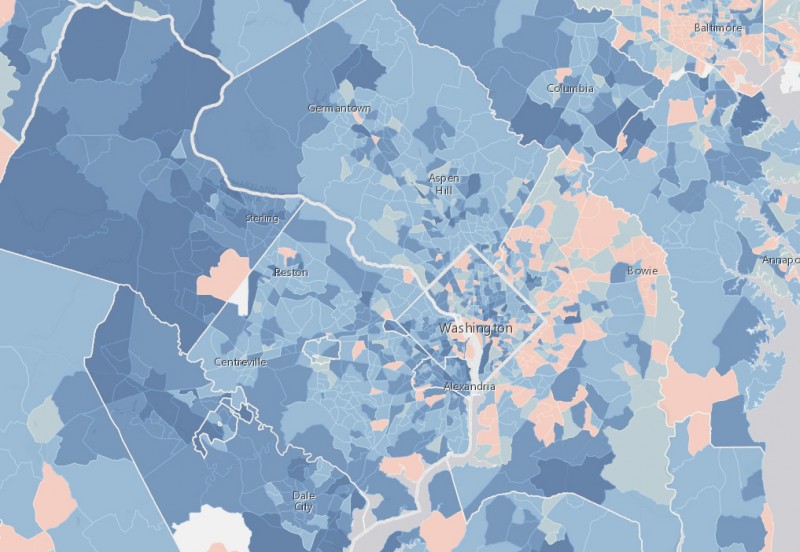
Zooming out even further to the national scale, the map changes to show growth by county, rather than census tract. The most interesting story here may be where rural counties are growing, despite the national narrative of rural decline. The interior west and south Atlantic coast seem to be doing OK.
Growth in the United States. Image by Esri.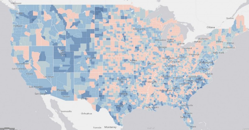
You can zoom to any city or area in the United States. Chicago, for example, shows a clear pattern of growth in the core and outer suburbs, but struggling middle suburbs.
Growth in Chicagoland. Image by Esri.
While Seattle shows relatively consistent growth throughout, and no Chicago-like boom-or-bust pattern.
Growth in the Seattle area. Image by Esri.
What stands out to you?