Here is a map of… something in DC. Can you guess what?
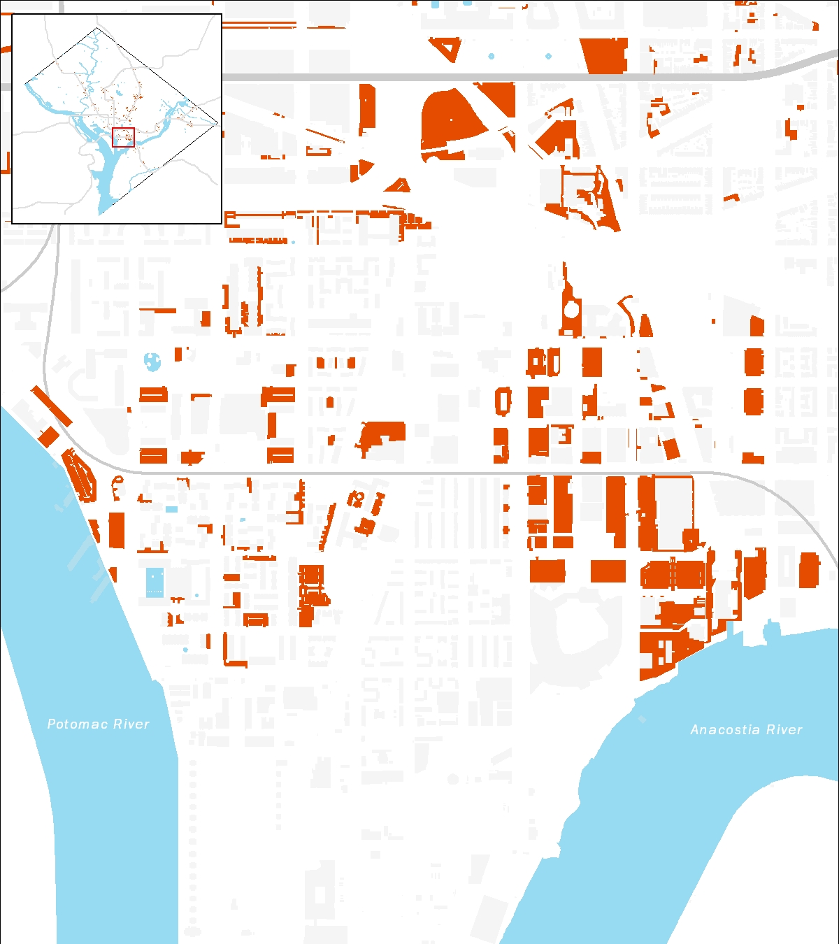
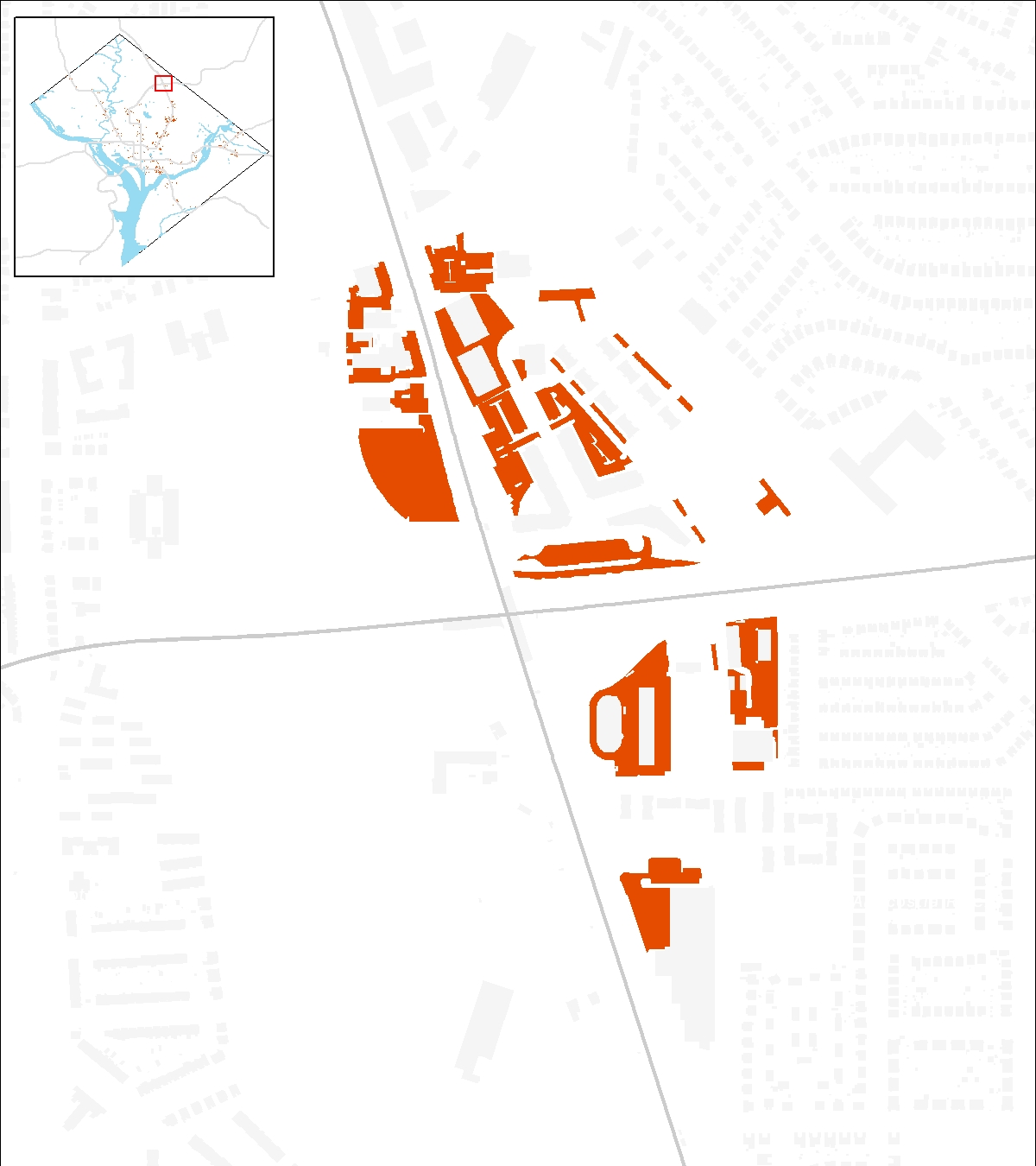
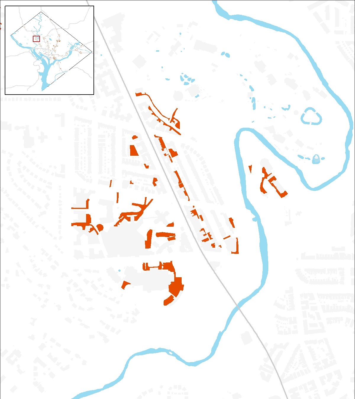
Here is another map of… something in DC. Last time we showed a map of buildings most likely to be inundated by a hurricane surge, and everyone who guessed got it right. Do you know what this one is showing? This week’s clues are the zoom-in maps themselves.
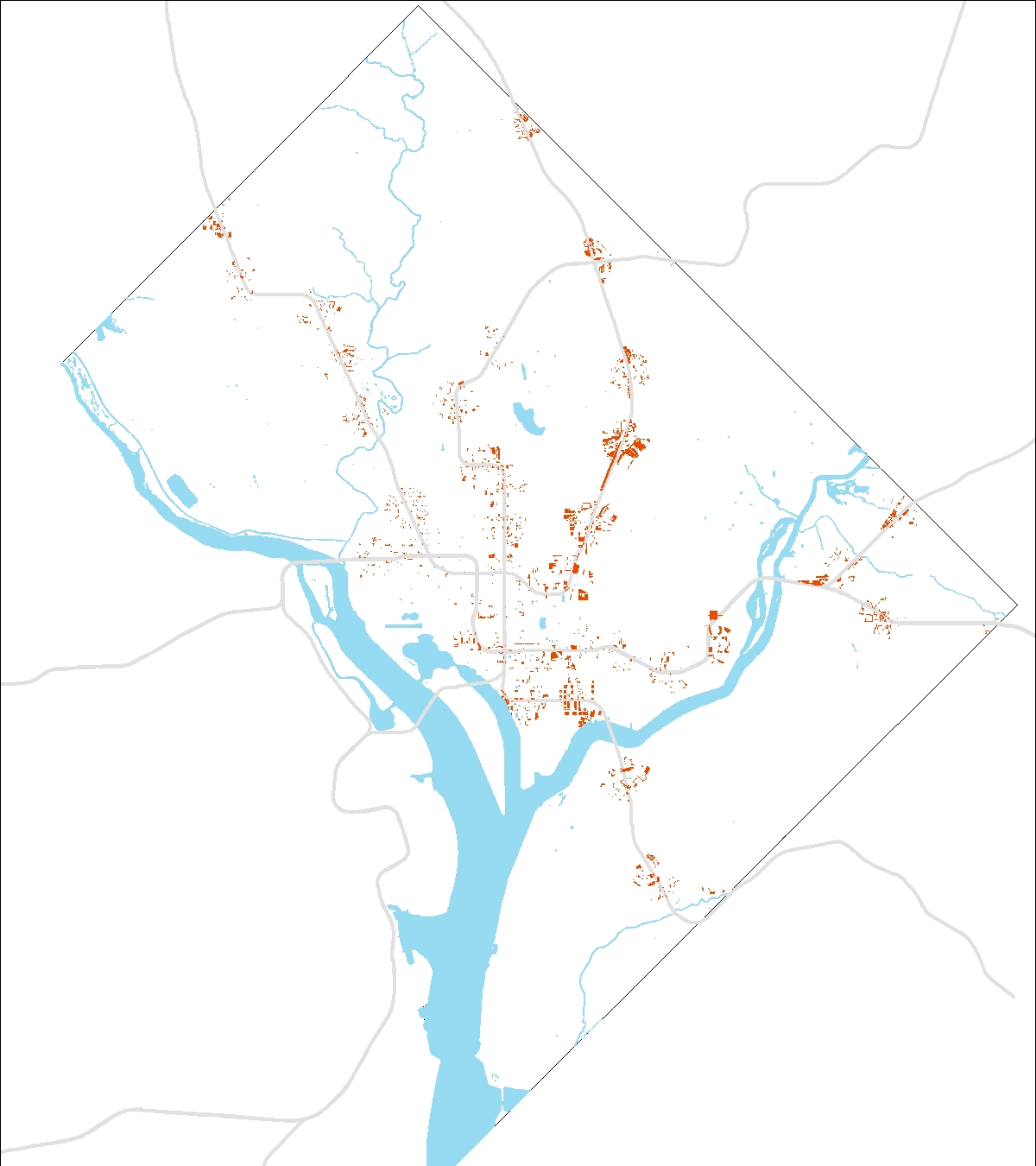
All maps made by the author using data from the District government’s open data portal.
A closer look:

We’ll hide the comments and update the post and tweet the answer on Friday.