The river between Milk and Tyler
This weekend’s viral sensation is the New York Times’ maps of Netflix users’ preferences by ZIP code.
Most evident from the maps of the DC area is the divide in movie preferences between the majority-black parts of the region and the majority-white parts. Just look at Milk, the #1 most-rented movie in most of northwest DC and Capitol Hill, but which doesn’t appear anywhere in the top 50 in 20019, the ZIP code containing most of Ward 7, or Congress Heights’ 20032. Meanwhile, 20019 and 20032’s favorite, Tyler Perry’s The Family That Preys, is nowhere in the list anywhere west of Rock Creek Park or the Potomac.

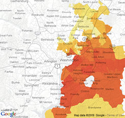
Netflix preference maps for Milk (left) and Tyler Perry’s The Family That Preys (right).
Are there movies that illustrate the urban-suburban divide instead of the black-white one? Not nearly so strongly. Maybe Taken, whose popularity seems proportional to distance from Woodley Park but not especially related to direction. Vicky Cristina Barcelona appears to correlate somewhat with income, being only popular in the Favored Quarter, especially in Bethesda and upper northwest DC.


Netflix preference maps for Taken (left) and Vicky Cristina Barcelona (right).
But there’s one thing Washington area residents can agree to watch: reverse aging. Every area rented The Curious Case of Benjamin Button in large numbers.
Update: If you scroll the maps, you can see data for other parts of the region, most notably including Baltimore.