Visualize Metro rides, CaBi trips, and Beltway travel times
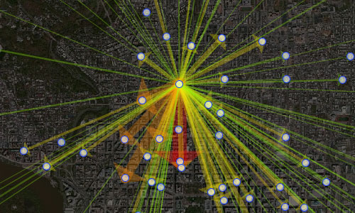
MV Jantzen has created another neat Metro-related visualization. This one lets you see the pattern of trips on Metro from a given starting station, based on data from 2007 (unfortunately, the only data available).

Metro trips from Brookland. Click for interactive version.
Mouse over a station to see the trips from that station. The blue circle shows the magnitude of trips starting at that station, and the red circles show the relative number of trips ending at each station.
Rahul Nair, a faculty research assistant at the University of Maryland, has created some great visualizations as well. One shows Capital Bikeshare trips from one selected station. It’s displaying the same type of data as the MV Jantzen app, origin-destination pairs for a single origin, though it uses arrows instead of bubbles.
CaBi trips from 17th and Corcoran. Click for interactive version.
Nair also built a tool showing travel times on the Beltway, using data from INRIX for 2011:
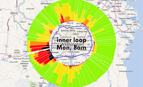
Inner Loop (clockwise) traffic on Monday at 8 am. Click for interactive version.